Country homes & interiors magazine
Reply

Looky looky, how exciting, we’re in the Homes & Gardens christmas gift guide


Woohoo! indeed

Imagine my excitement when I was approached by the lovely Lucy at Rowen & Wren, to design and print a set of Christmas cards and gift tags for their new AW13 collection.

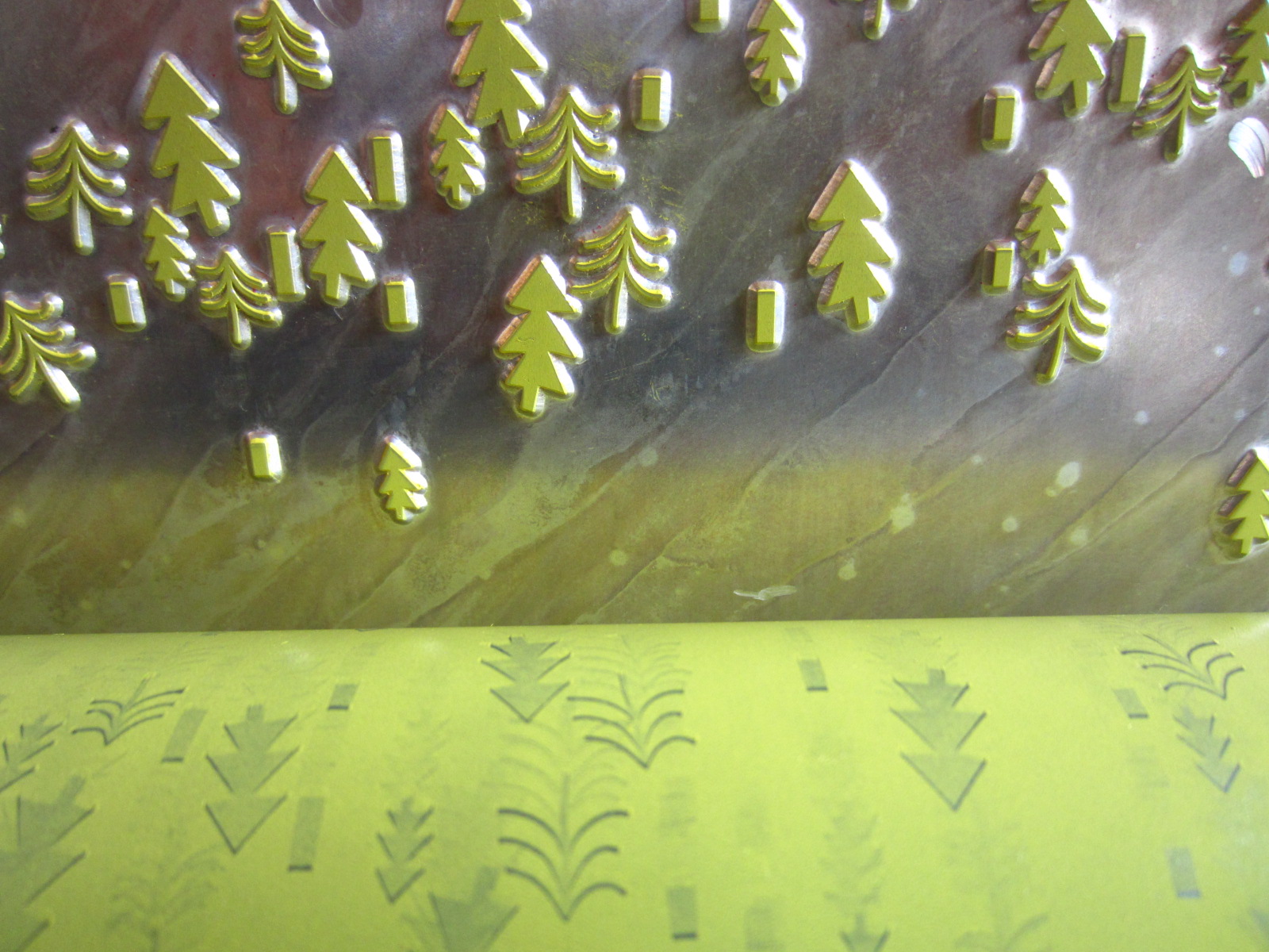
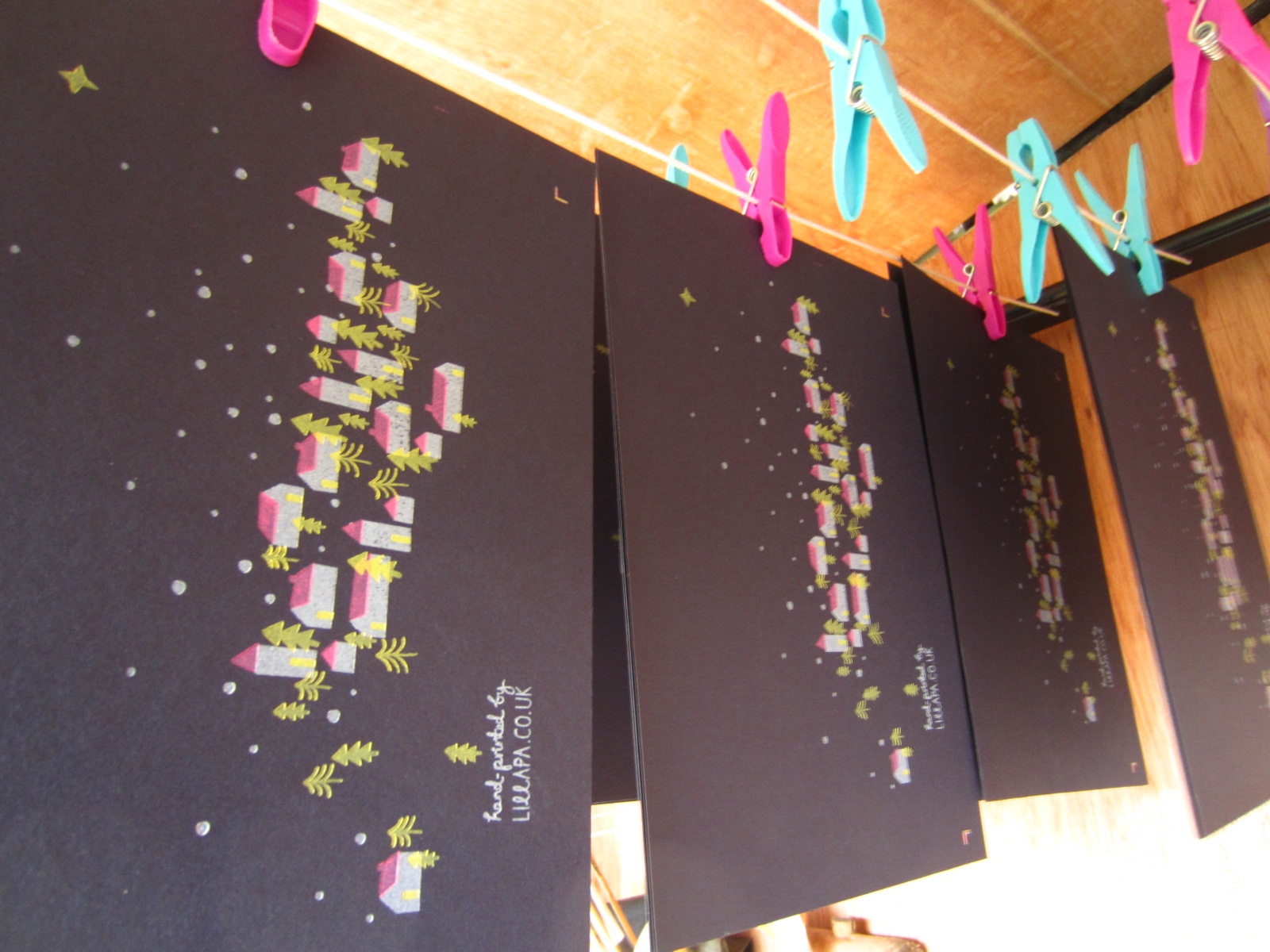
Lucy loved the cosy christmas design from last year with our winter trees and log cabins, so I wanted to present a few options I thought might hit the mark. I liked the idea of producing something a little more classic, that suited Rowen and Wren and the direction they were taking. They also had a lovely colour palette to play with, incorporating inky blues, sage greens, soft greys and burnt oranges. In the end we settled for the winter berry design, in two colourways - indigo and eucalyptus, letterpress printed onto a beautiful textured stock, and finished with a flourish of satin silver foil. Righty-ho, time to rustle up the troops and get started.

Making minor adjustments to Bertha, before the initial print run.

First pass, and safe storage while we’re waiting for the ink to set off, ready for the shiny bit

I liked the contrast of the ink on the textured 320gsm card and the super slick foil finish. The card sets are completed with ribbed Kraft envelopes in a glassine bag. The berry motif was also picked up in the kraft tags and header cards too. I used rubber stamps for the packaging and bound the envelopes with bakers twine picking up the colour from the prints. A pleasing result.

Matching the second colourway, almost there.

The tags were hand pressed from a cutting die I designed, I preferred the scalloped edge to the usual tag shape, I thought it suited the design better.

Just adding the finishing touches.

The final cards and tags in their glassine bags and kraft packaging.

Packed and ready for off, how satisfying

The final pictures shot by Rowen and Wren…Thank you kindly R&W xx

If you’d like to purchase a set of cards or tags you can find them here.
http://www.rowenandwren.co.uk/servlet/the-301/Winter-Berries-Hand-Printed/Detail
An update on Vanilla Sense, looking at homepage and packaging, as I didn’t really cover this in previous post.

This was an initial proposal for the route Bettina decided upon, just giving a flavour of how the flag from the the logo could be picked up in the packaging.

The cake, the cards, and the cute little flags, which double up as stickers for sealing boxes and bags.

Nice close up with liberty fabric.

The finished packaging with cards and flag cake toppers.

What can I say…they don’t hang around long. Yum yum!

The acting temporary homepage, until Bettina gets her portfolio of work together.
An exciting new project, sneaky peek…

So pleased to be able to support another new business idea. Vanilla Sense is a new venture from Bettina Perdomo. She creates delicious cakes and desserts, I can concur, they are indeed amazing. She mixes her South American routes with a British sweet tooth , for an interesting combination which I’m sure will be a success. Vanilla is actually a really interesting plant, an orchid no less, which translates as ‘little pod’ – cute. It grows as a vine, climbing up an existing tree or other support, which is what we have tried to capture with the curly V clinging on to the A. Subtle, but we like it. Good luck Bettina, and if you need any more guinea pigs for cake tasting, just say the word! xx

Almost there, just a little tweak to go

Inked up and ready to roll

The peg shot

How satisfying, a fresh stack of printed goodness

The finished print, Naturalis in smooth vanilla, 330gsm, single colour print run.
Congratulations Em and Trev – a wonderful day, fabulously captured by Sam Docker
 http://www.samueldocker.co.uk/emma-trevor-donington-park-farmhouse-derby/
 I particularly like this one in the camper

Some of the finer details

and a little contribution from Lillapa…
 …and the end result.
My oh my, where does the year go. Thank you for all your support this year, there’s a wee card in the post to say thank you muchly. xx

Colorplan in imperial blue, 350gsm and a three colour print run.
A good friend of ours has decided to embark on a new venture. He’s leaving his feathered friends behind, and instead starting a business taking small groups on tailored excursions. Building on his previous work as a driver and guide on overland tours in exotic places. He will be taking clients on tours of the UK, visiting places of architectural, agricultural and historical interest and will organise all travel and accommodation too. He already has his first group signed up and they’re coming all the way from Chile. It’s going to be a whirlwind tour, covering the length and breadth of the UK, should be good fun.
 Business card, Colorplan in imperial blue, 350gsm and satin silver foil finish.

Folio with button & string fastening

Letterhead & folio cover
We decided to use the compass motif in the end as it was ambiguous enough to cover the breadth of his tours and subject matter, but also suggestive enough for the work he will be embarking upon. It also allowed us to play with the placement of the motif, turning the compass on it’s head so the W becomes the M instead. This was initially going to be a letterpress brief, but the simplicity of the job felt like it needed something just a little more special. The foil finish did just that, and the distressed finish you get on the navy stock, gives it a more vintage feel. A happy customer. Michael’s surname incidentally is Barker which translates as shepherd, perfect for someone who will be looking after and guiding individuals. We wish him all the luck in his new venture.