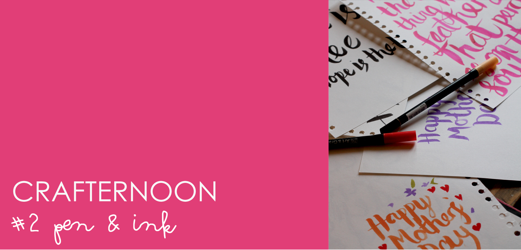
 The second of our crafternoon sessions – # pen & ink. We experimented with brush lettering and drawing with inks. The brush pens were a big hit, Zig and Tombow both being popular alongside the more traditional paint brush & ink.
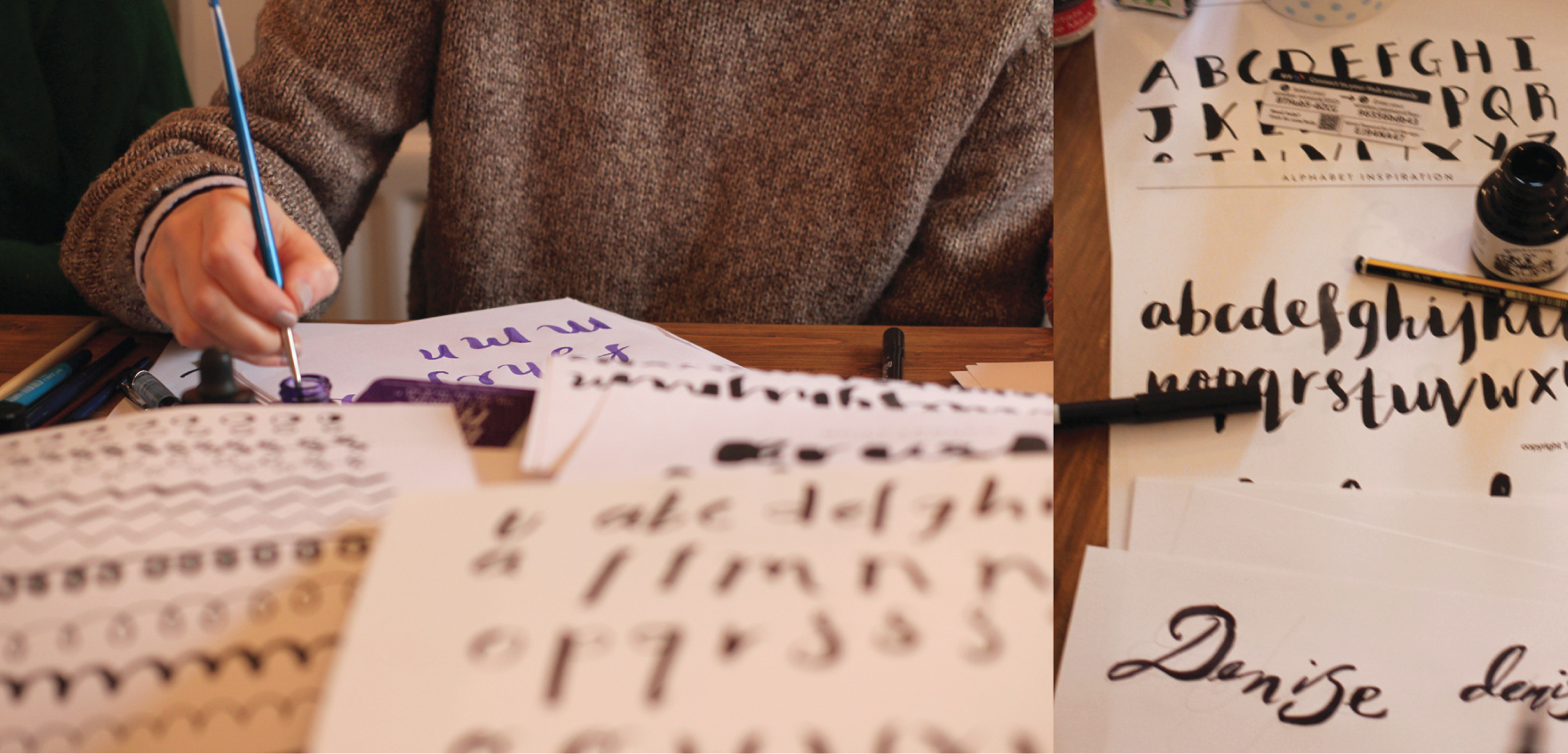 It was a bit of a type frenzy to begin with, w’s were obsessed about. We put into practise some basics, stroke, varying direction & pressure (fat down, thin up : )
 Then the colours came out – and the masking fluid, opened up a load more potential. Beautiful washes of colour with type reversed out.
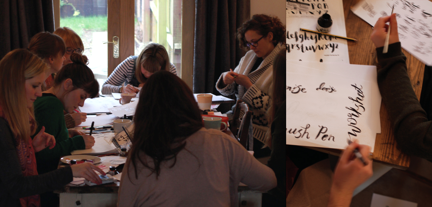 Tea drank, pastries eaten, silence descends as the concentration levels hit their peak : )
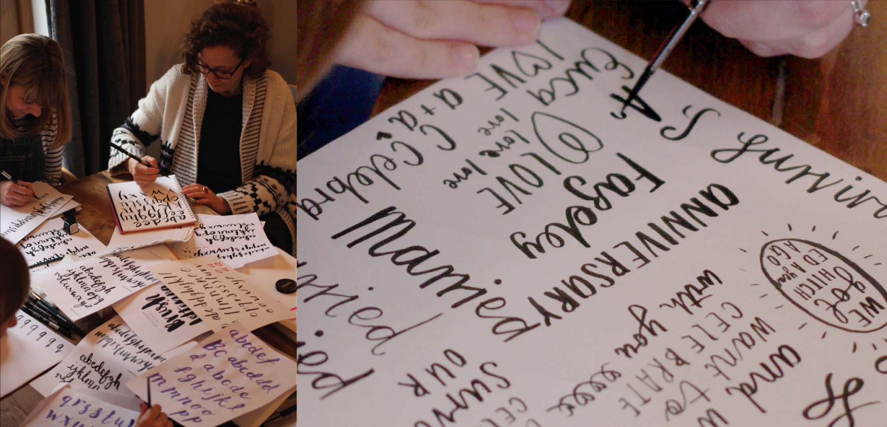 We had all thought prior about type we may want to explore, so we had poems for friends, type for wall art and a little boys bedroom, birthday wishes and party invites.
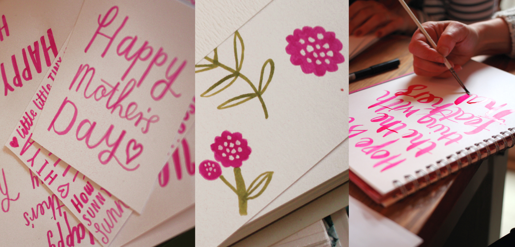 It was of course the run up to Mothers day, so a lot of us tried our hand at making something we would be happy to send.
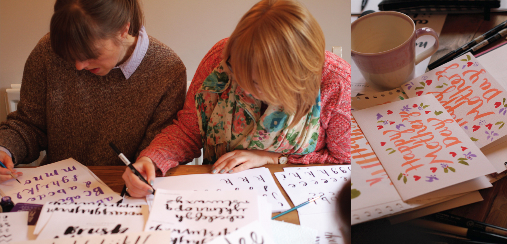 Tongues out – mean business : )
 It was nice to see everyone’s individual styles start to come together, quite a varied bunch in the end.
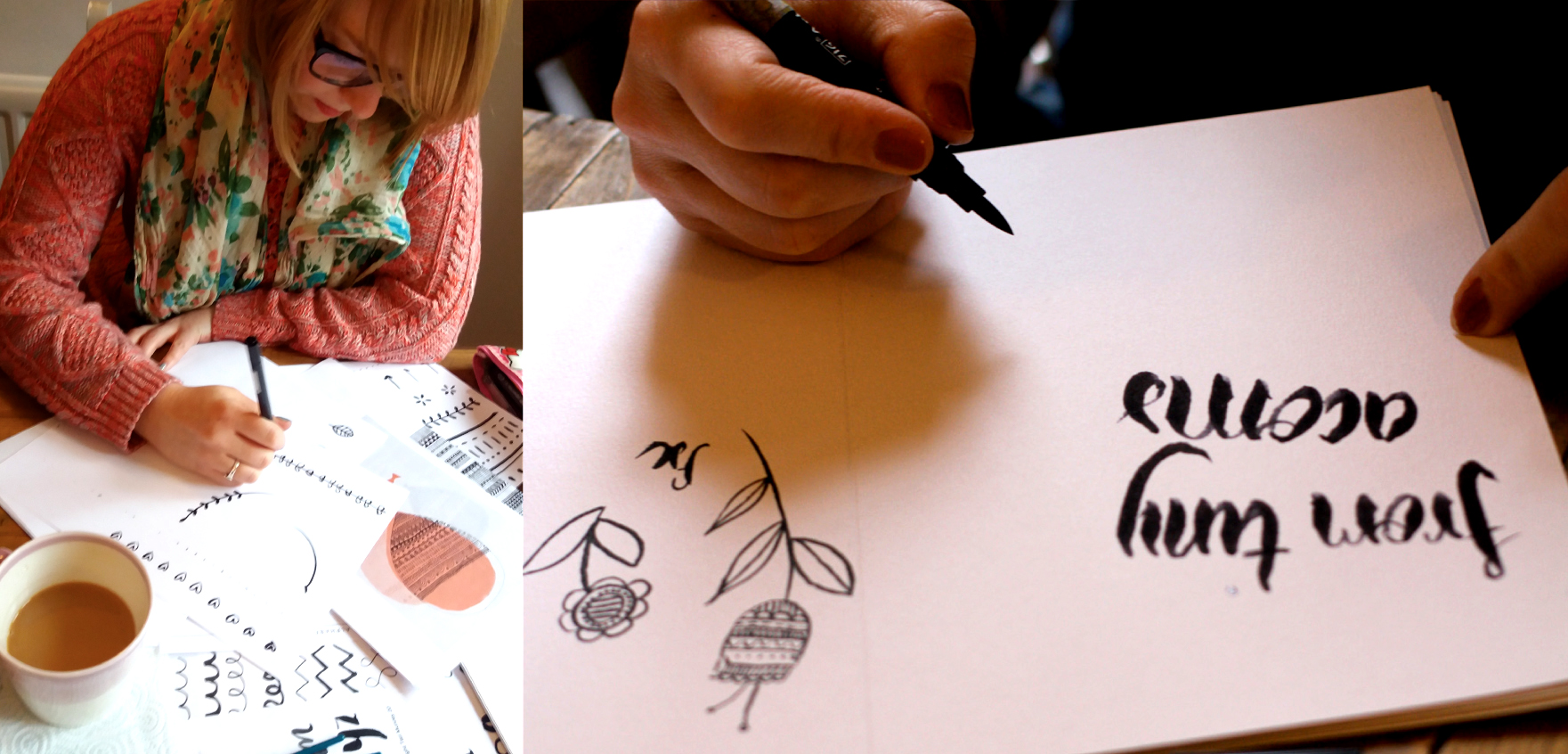 Little geo repeats and graphic florals explored amongst others…
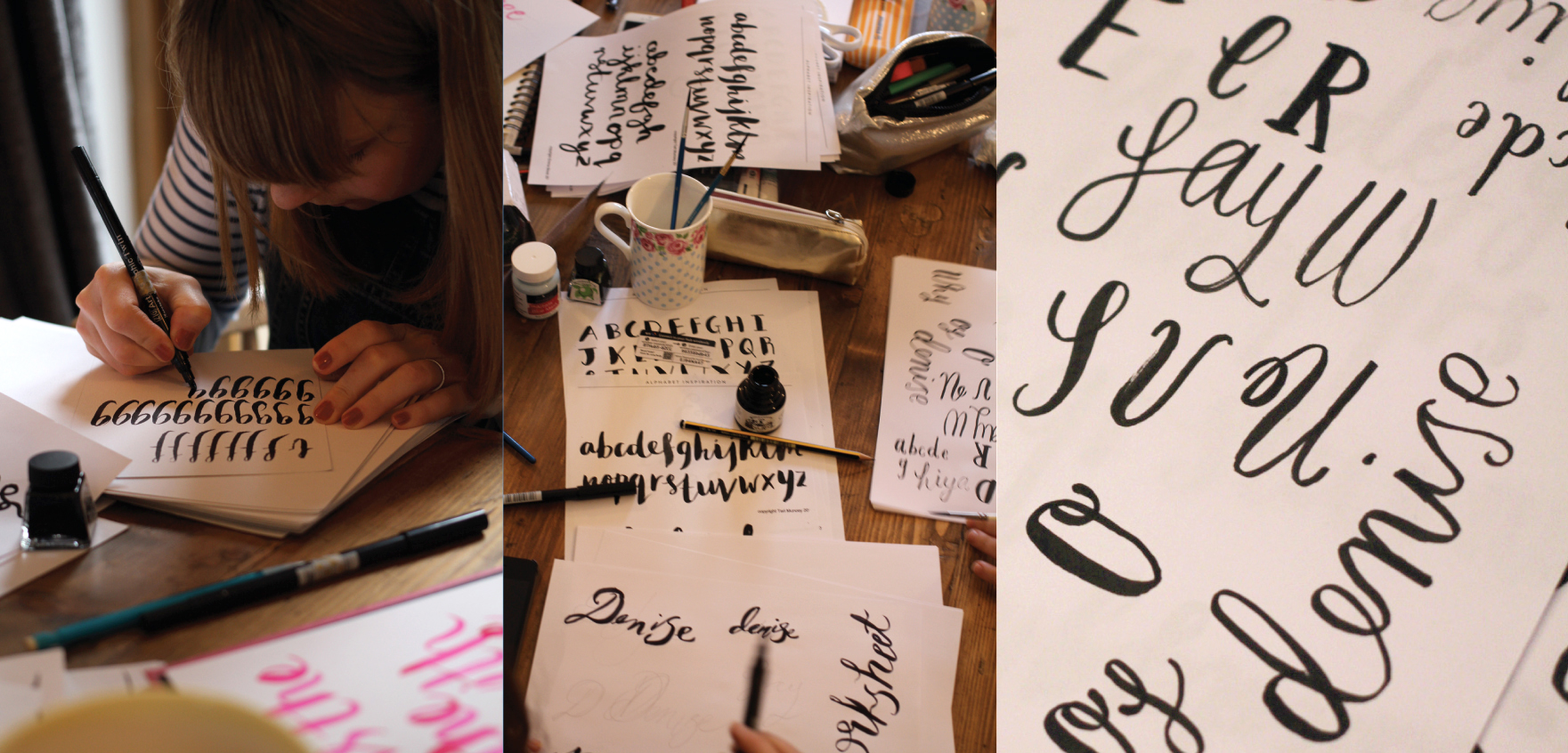 … and beautiful contemporary script.
Monthly Archives: February 2016
Anna & Ian’s wedding invites
A beautiful spring wedding and a vibrant palette
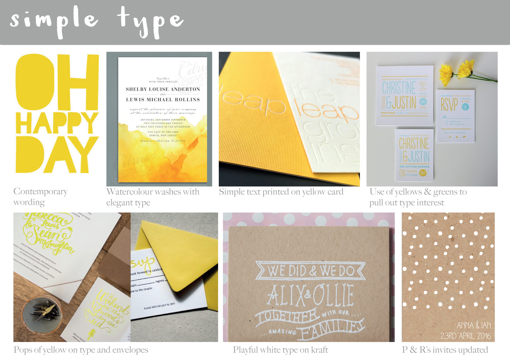 After chatting to Anna and getting further details and an idea of what the couple were looking for, I compiled initial mood boards to show potential direction – this one is for the simplicitity of type…
 …and this one to be suggestive of spring – but not to fussy. They loved the idea of yellow as daffodills were going to be part of their floral displays on the day.
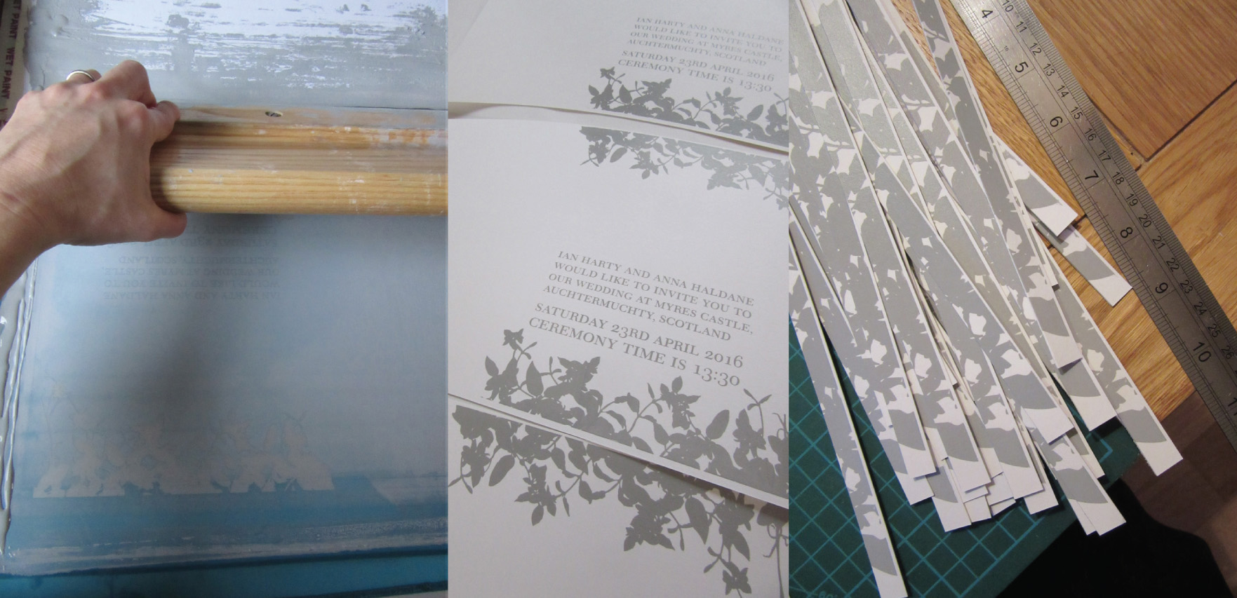 First pass, the grey type for the front cover – simple and elegant, with leaves being used over flowers as decoration.
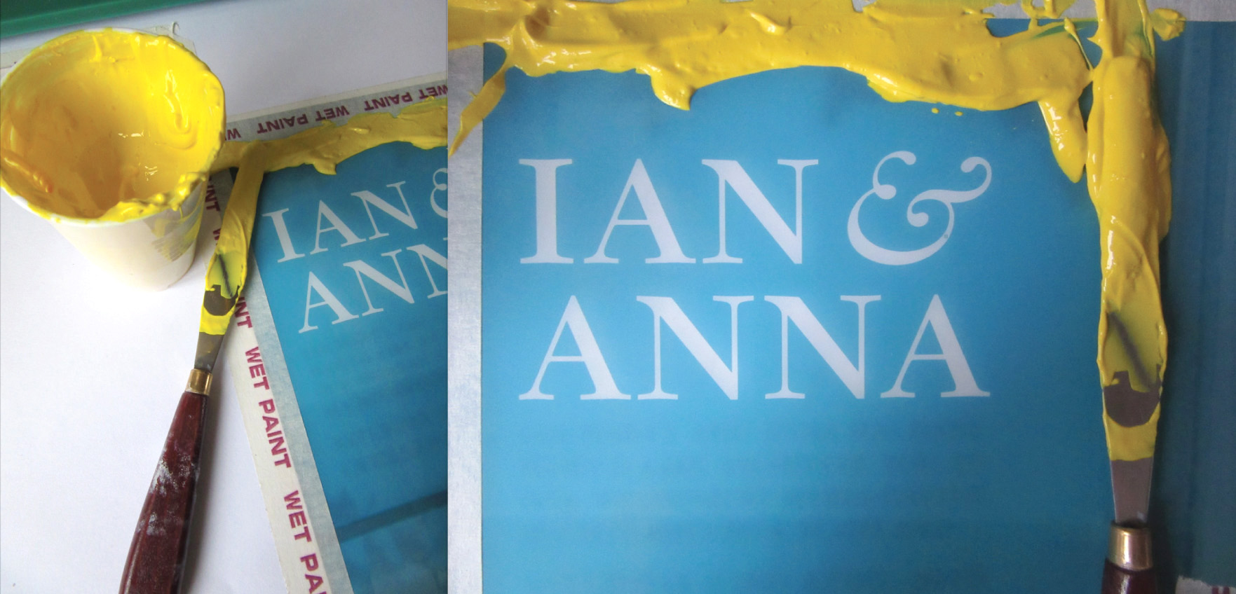 Love the yellow – mixed to match the vibrant yellow envelopes.
 Second pass and initial cuts to enable registration of the internal type details
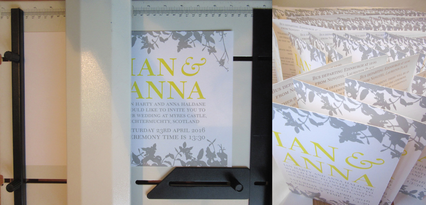 All printed, time for final trimming and the fold
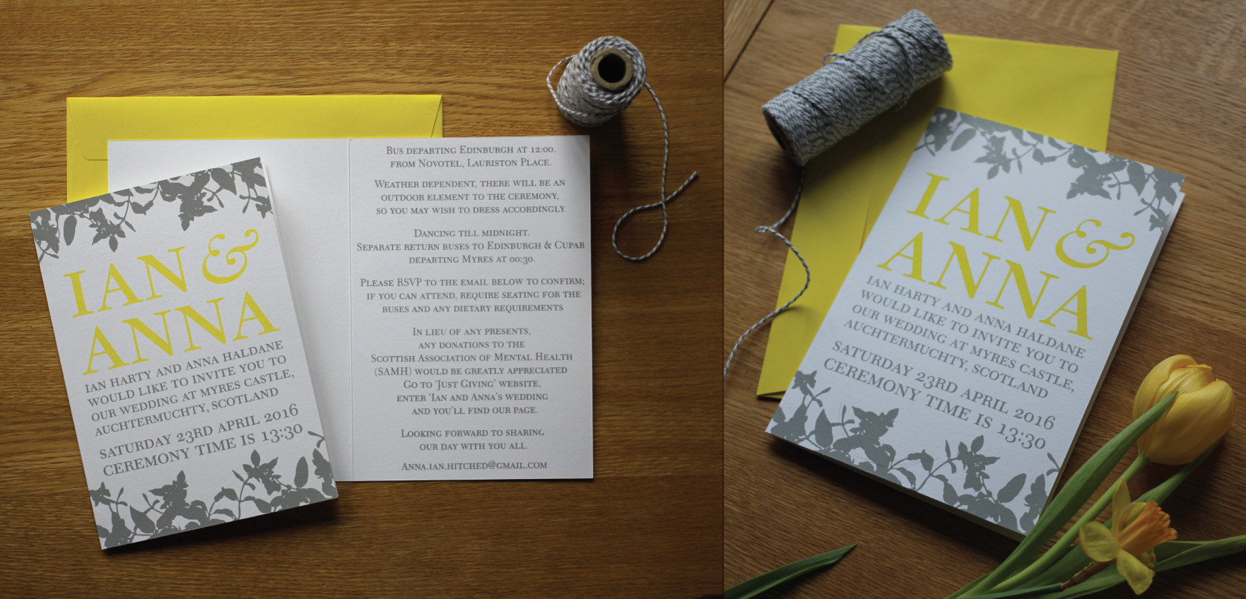 The finished invite, the yellow is a very happy colour indeed : )
