So I was seduced by a bit of subtle sparkle this Christmas – subtle sparkle, is that possible? : )
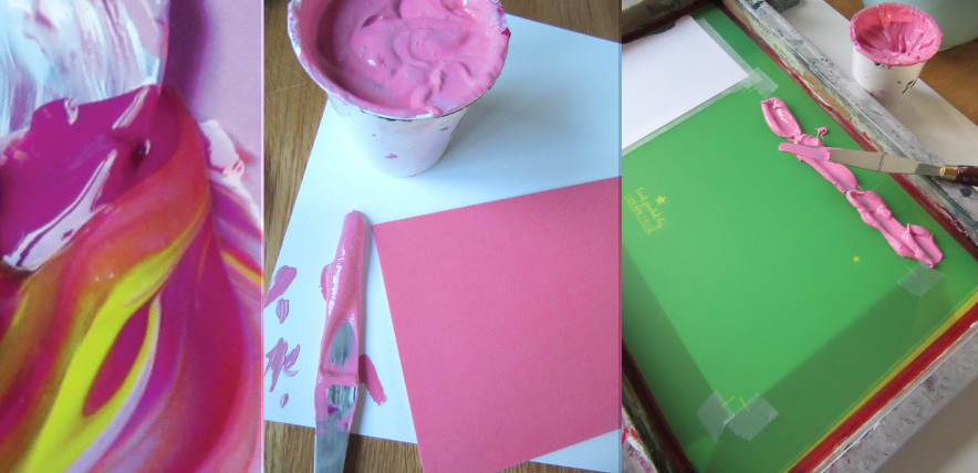 One design, two colourways. A vivid pink and kelly green, both colours mixed by eye to achieve the colour of the envelopes sourced.
 The clear foil is really beautiful to use – it gives what could be a very subtle debossing, a little help.
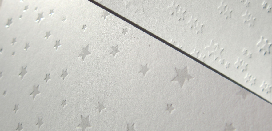 Just because I get asked, I wanted to show you the difference between clear foil (which replicates a spot UV) and a debossed image for a nice deep impression.
 Green version – just for Alex : )
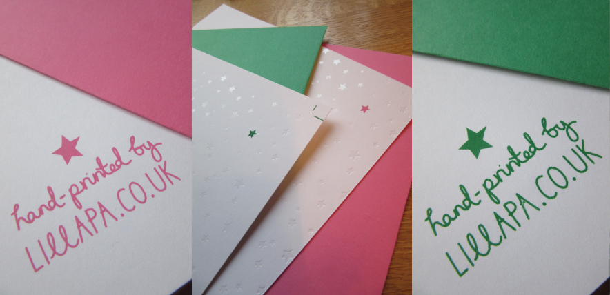 The finished prints – I love the simplicity of the design this year, with just that little pop of colour.
 All set ready for Alan the postie.
Merry Christmas everyone, hope Santa was good to you all : )
Category Archives: graphics
Smart as a…
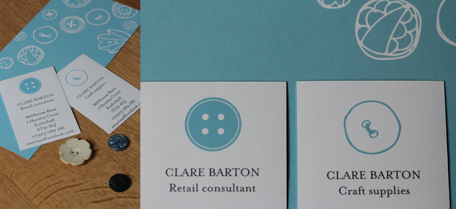
Interesting project designing an identity with a dual personality. On the one hand a creative craft business – fluid, fun and full of energy, and on the other hand a professional retail consultancy, still with a creative output but geared to a different customer base entirely – professional, business to business advice. I liked the idea of using the same motif but treating it in different ways to show the two scopes of the business proposition, appealing to the crafter and to businesses.
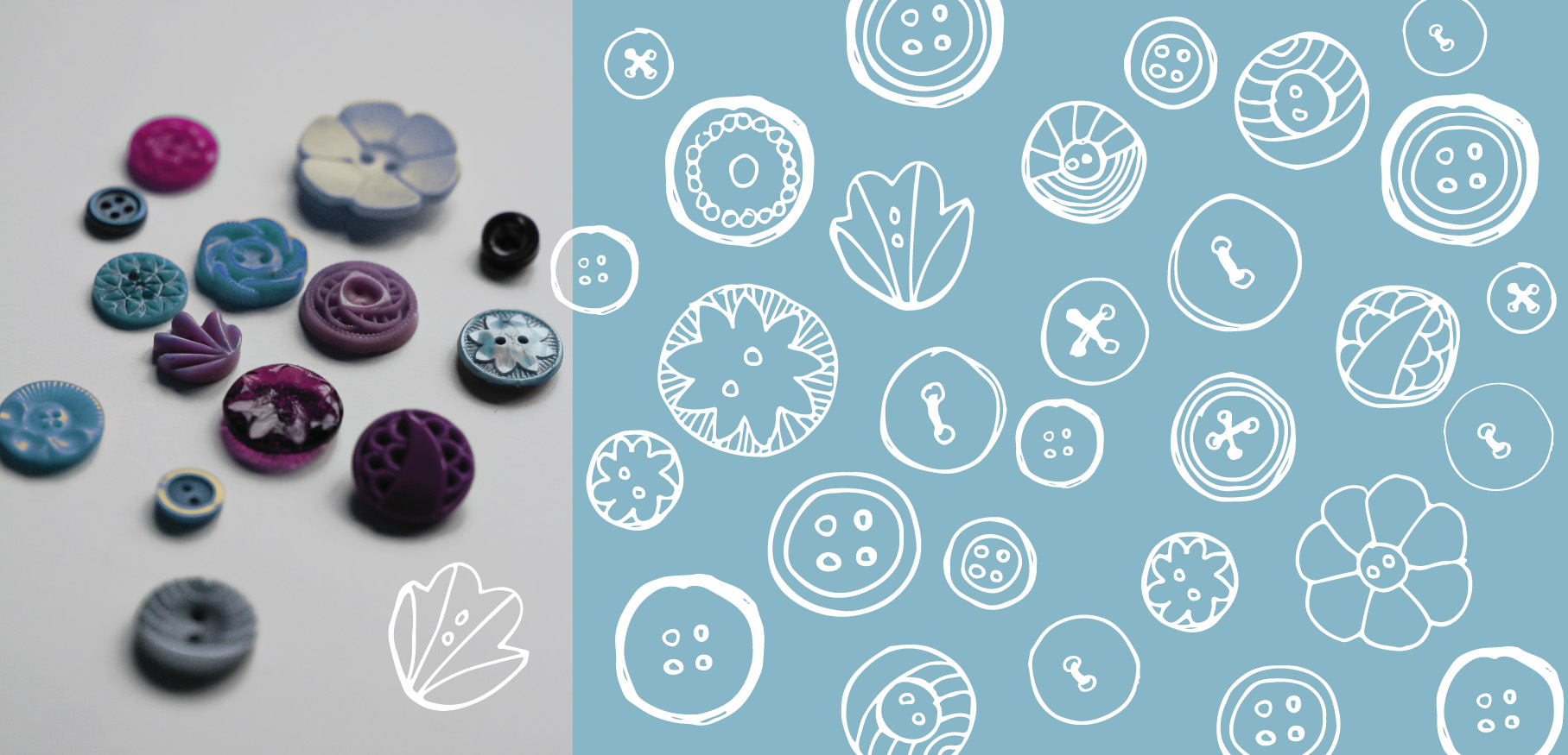 Starting point – raiding my button jar and initial sketches
 The full suite. Dual letterheads, comp slips and business card. Sticker seals were the icing on top.
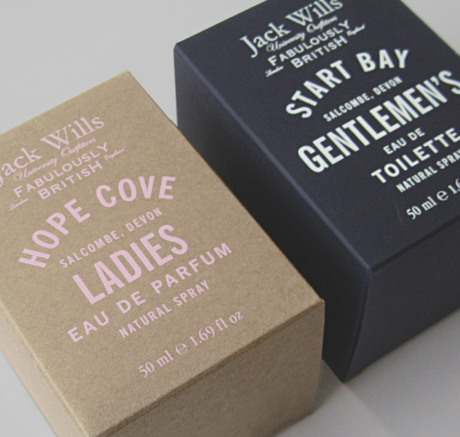
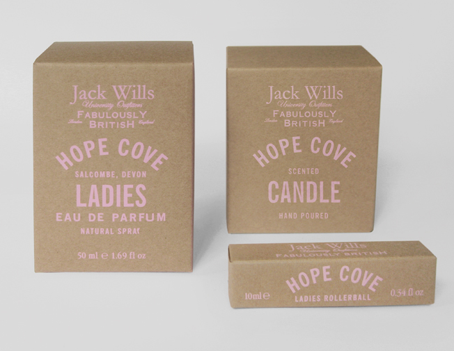
Lovely packaging – Sarah Thorne for Topshop and Jack Wills
I couldn’t resist, I saw the beautifully simple illustrations, hand drawn and quirky, the products looked so wonderful together, a lovely coherent collection – really striking. I was hooked, I couldn’t help it and I may have bought a couple of items.
I loved the hand drawn text and illustrations, uncoated paper stock, small droplets used for the waterproof mascara and starry sprinkles for the highlighter. Beautiful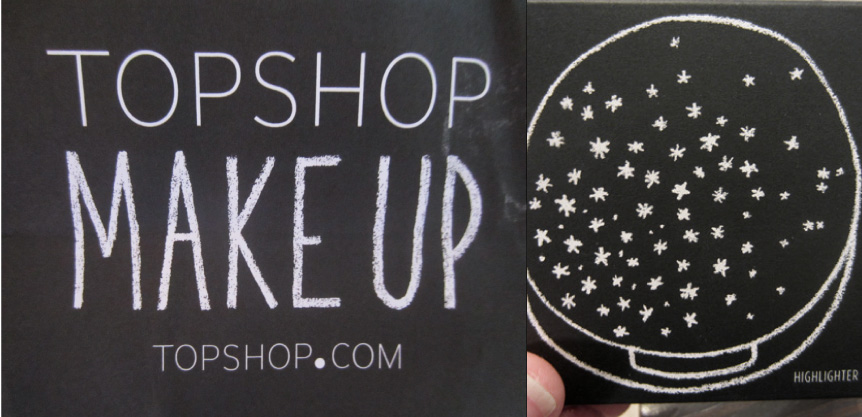 What a clever lady Miss Thorne is, you can see more of her work here.
http://www.sarahthorne.co.uk/topshop%20make%20up.html
I didn’t realise Sarah had designed the packaging for Jack Wills fragrance too, saw it just the other week, I liked the soft pink on Kraft paper