 The second of our crafternoon sessions – # pen & ink. We experimented with brush lettering and drawing with inks. The brush pens were a big hit, Zig and Tombow both being popular alongside the more traditional paint brush & ink.
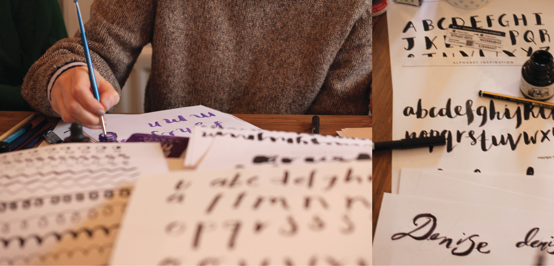 It was a bit of a type frenzy to begin with, w’s were obsessed about. We put into practise some basics, stroke, varying direction & pressure (fat down, thin up : )
 Then the colours came out – and the masking fluid, opened up a load more potential. Beautiful washes of colour with type reversed out.
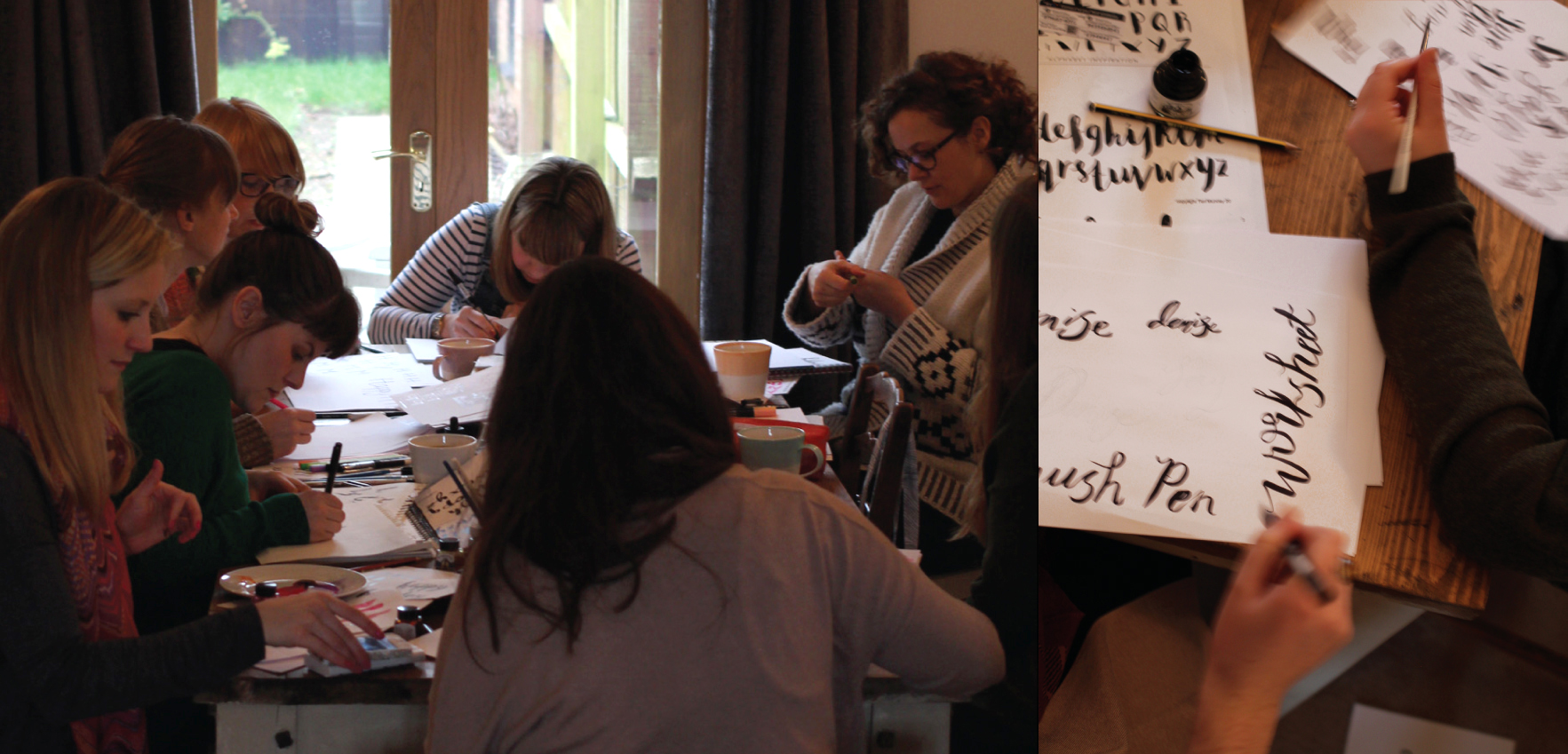 Tea drank, pastries eaten, silence descends as the concentration levels hit their peak : )
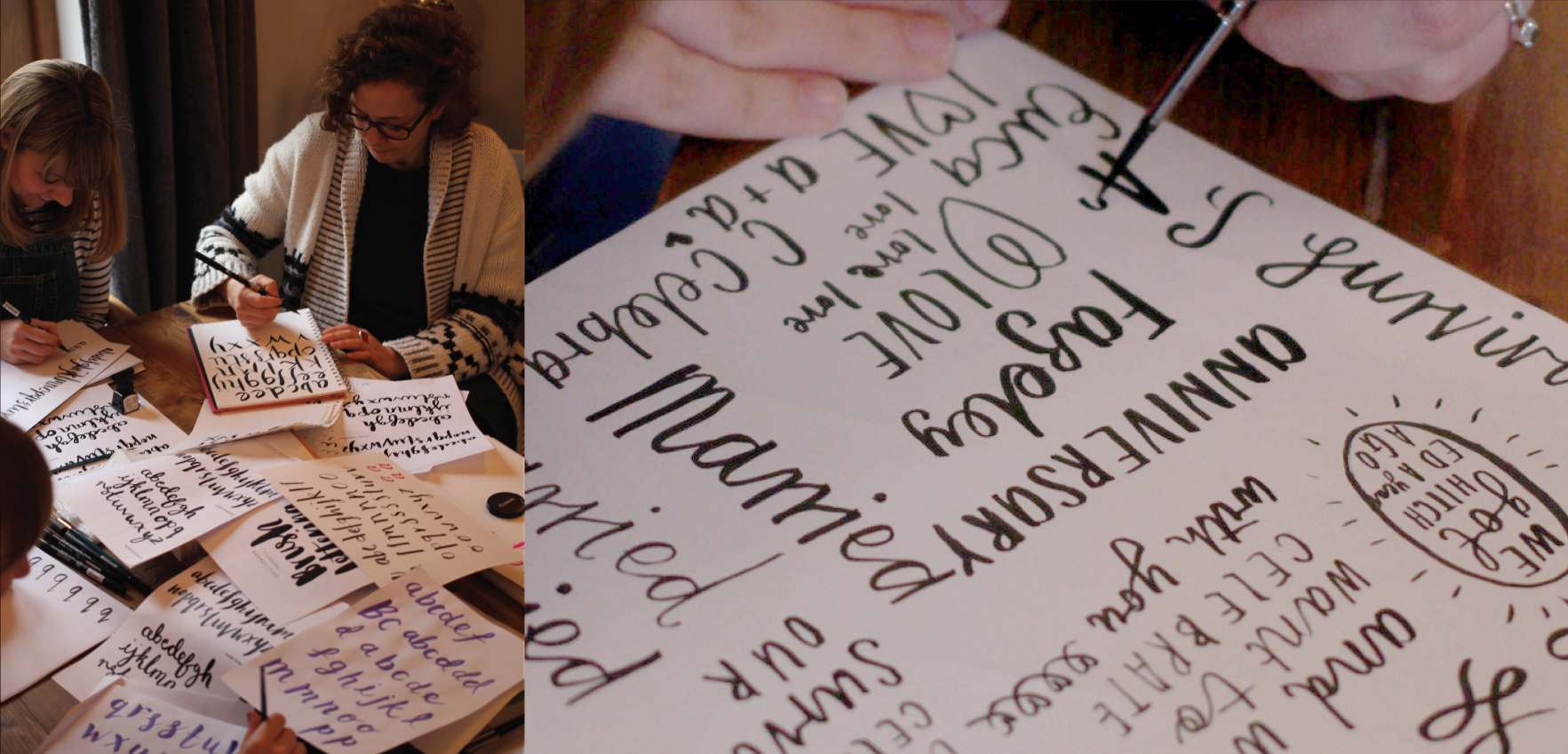 We had all thought prior about type we may want to explore, so we had poems for friends, type for wall art and a little boys bedroom, birthday wishes and party invites.
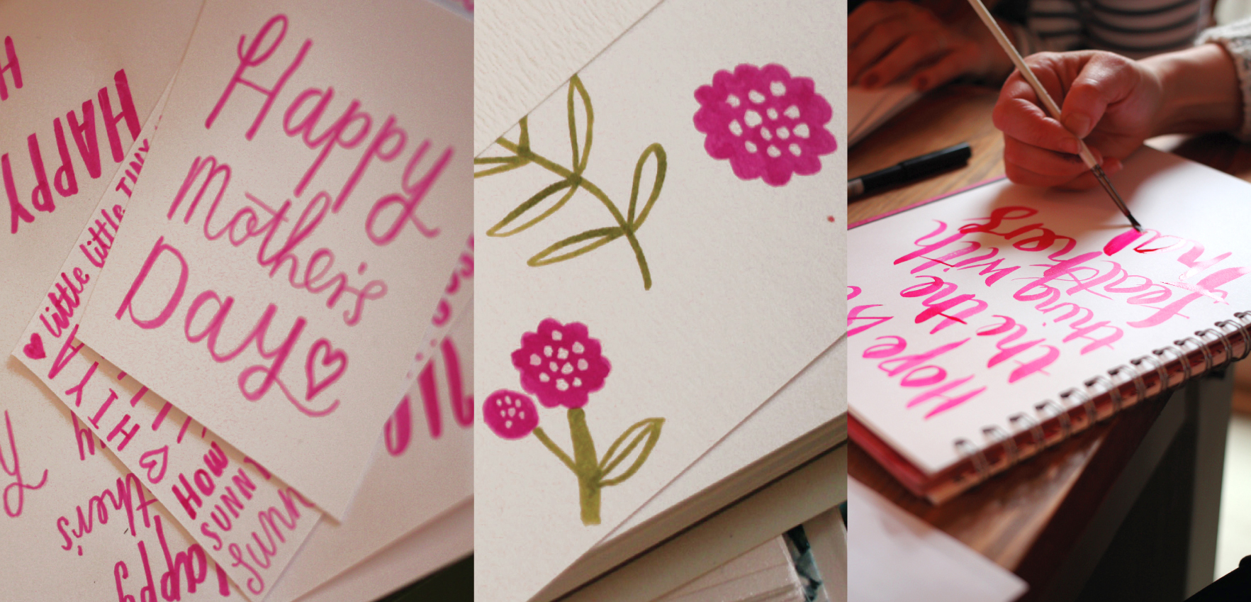 It was of course the run up to Mothers day, so a lot of us tried our hand at making something we would be happy to send.
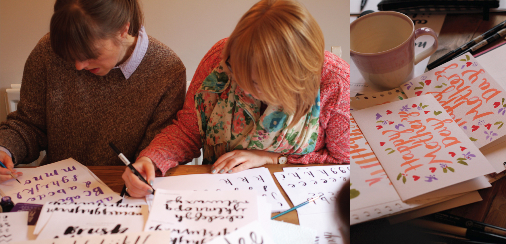 Tongues out – mean business : )
 It was nice to see everyone’s individual styles start to come together, quite a varied bunch in the end.
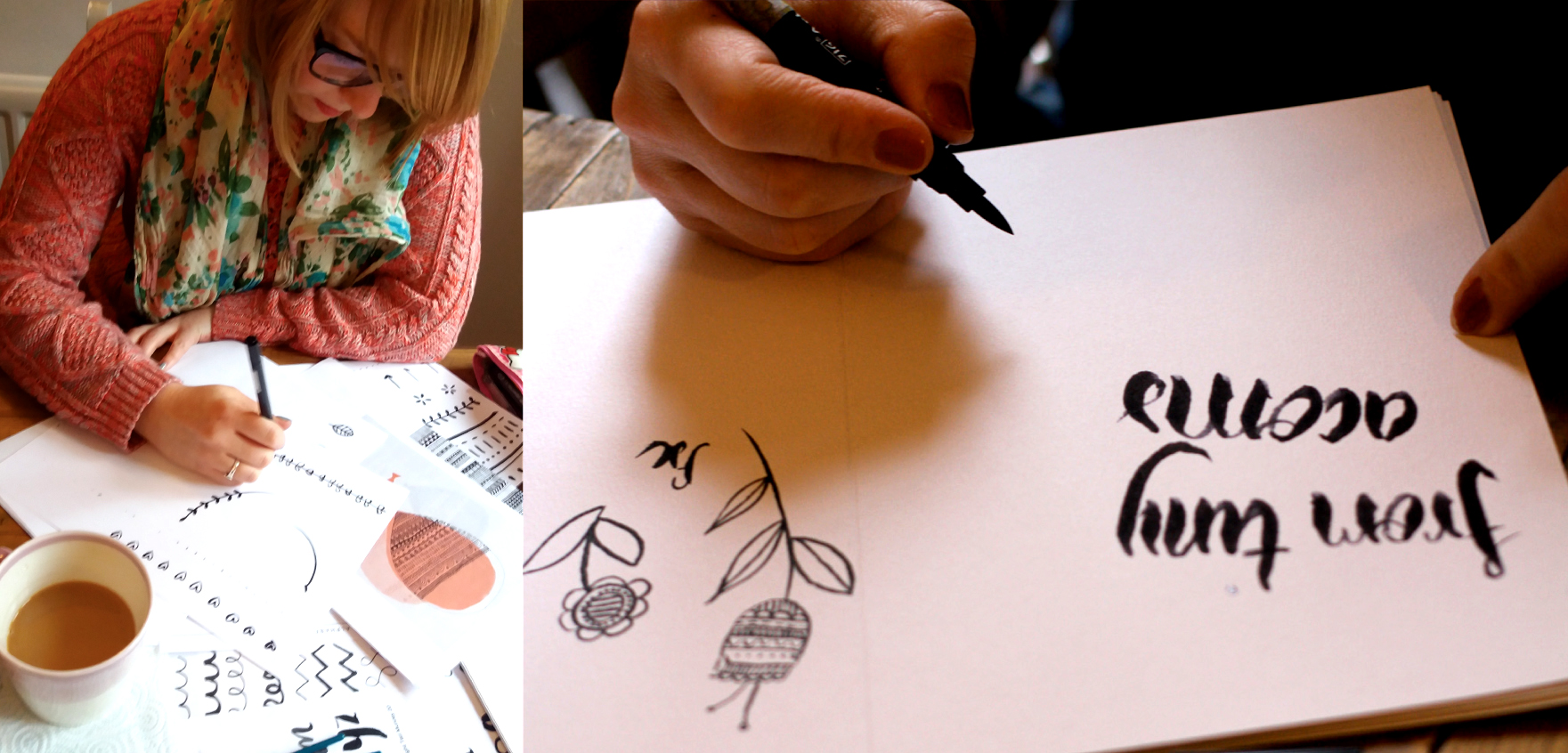 Little geo repeats and graphic florals explored amongst others…
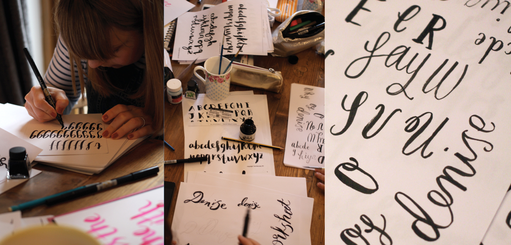 … and beautiful contemporary script.
Tag Archives: design
Anna & Ian’s wedding invites
A beautiful spring wedding and a vibrant palette
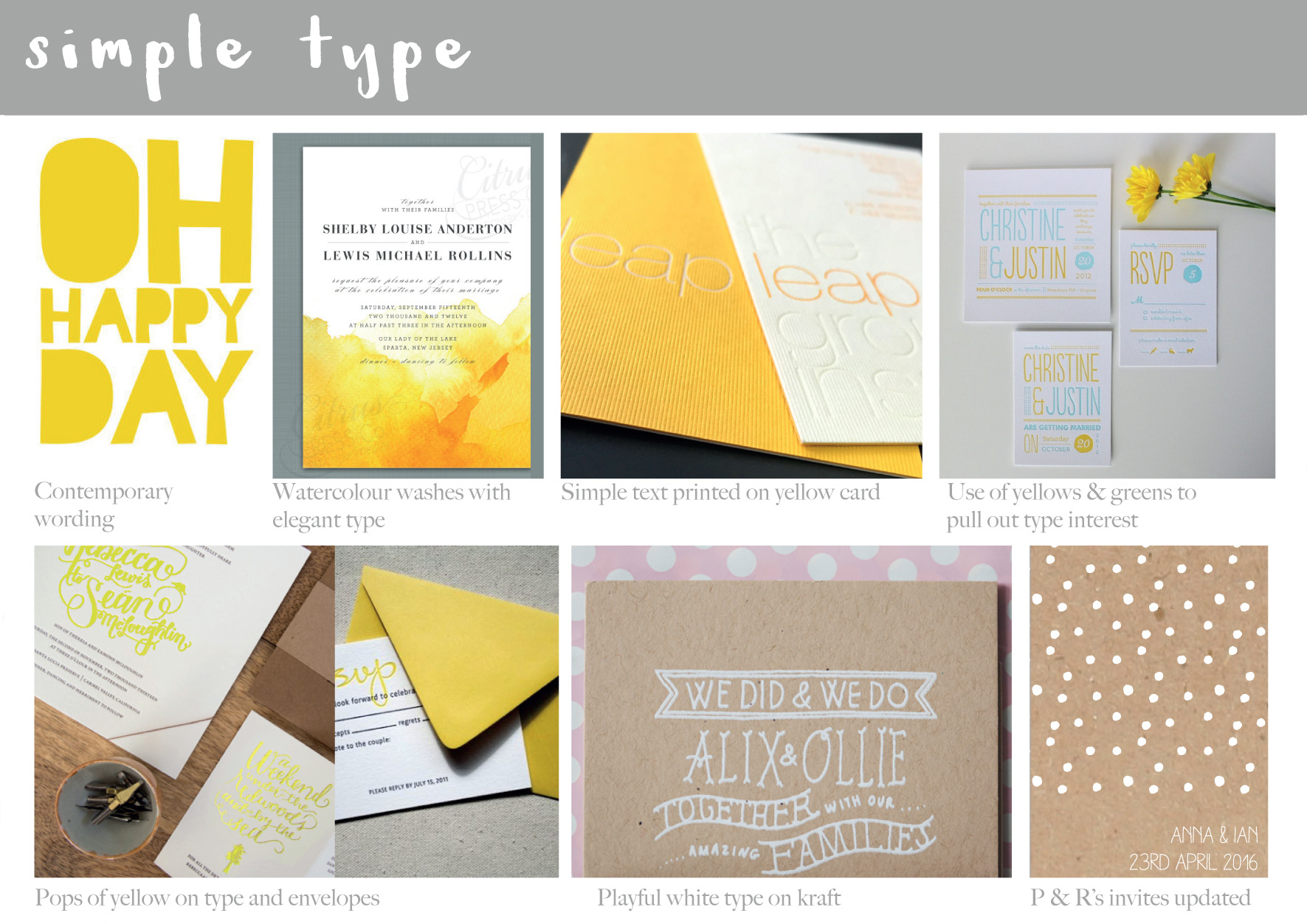 After chatting to Anna and getting further details and an idea of what the couple were looking for, I compiled initial mood boards to show potential direction – this one is for the simplicitity of type…
 …and this one to be suggestive of spring – but not to fussy. They loved the idea of yellow as daffodills were going to be part of their floral displays on the day.
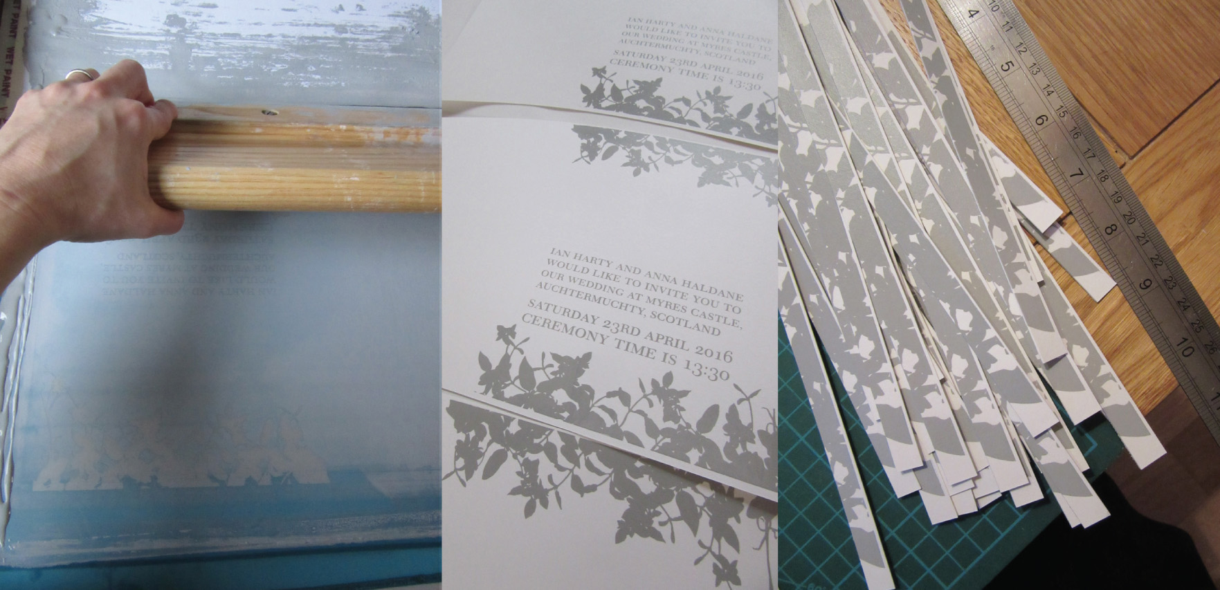 First pass, the grey type for the front cover – simple and elegant, with leaves being used over flowers as decoration.
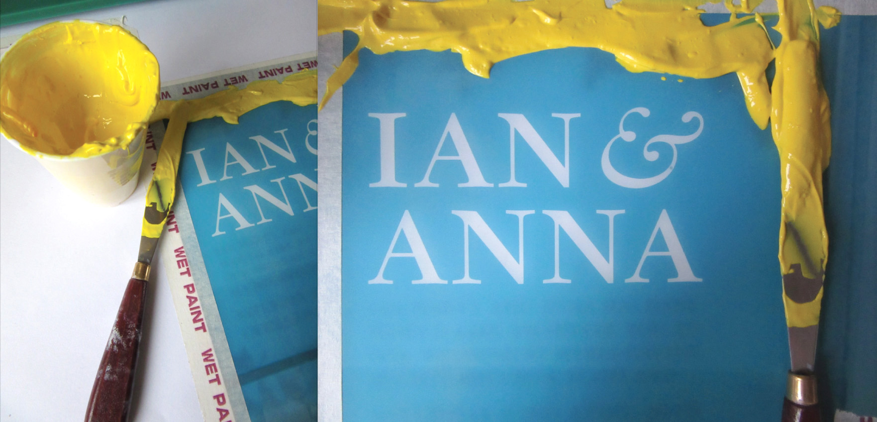 Love the yellow – mixed to match the vibrant yellow envelopes.
 Second pass and initial cuts to enable registration of the internal type details
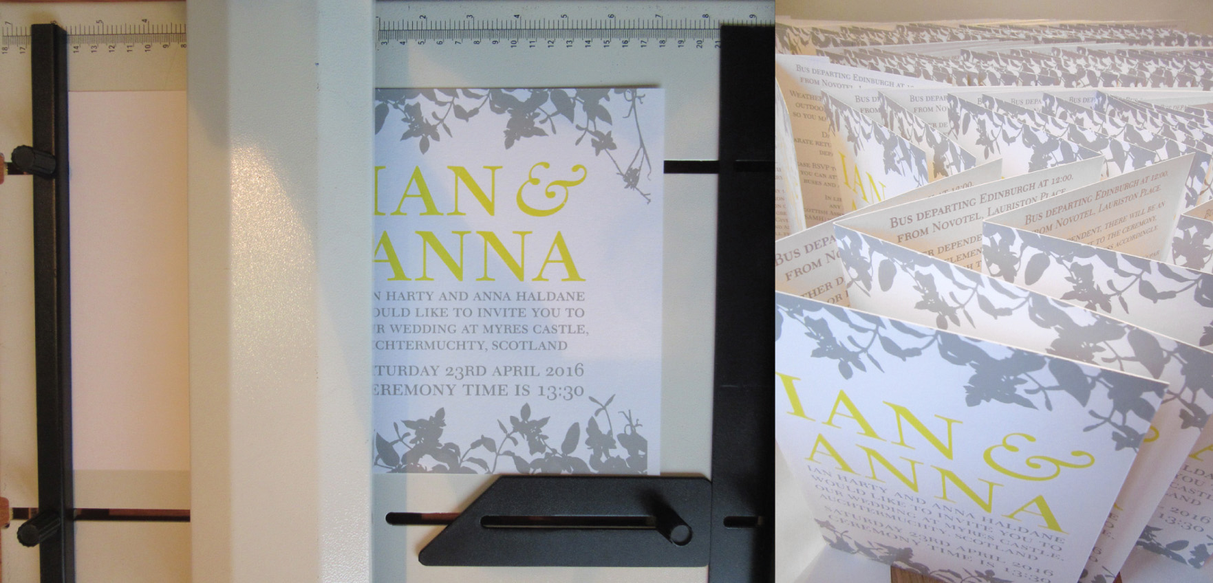 All printed, time for final trimming and the fold
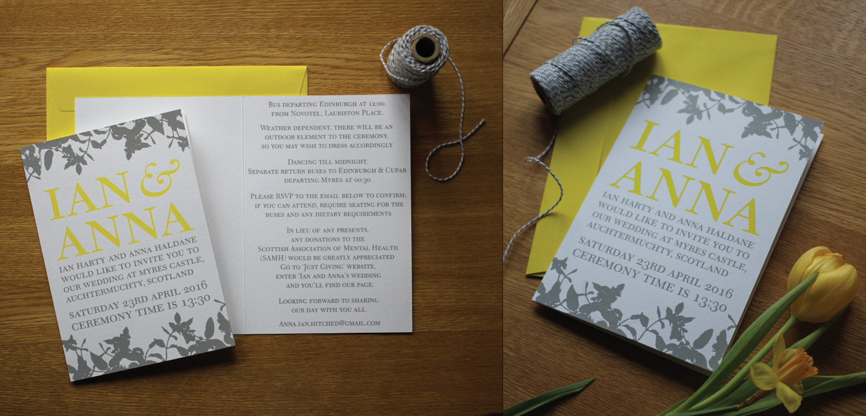 The finished invite, the yellow is a very happy colour indeed : )
Crafternoon session #1 Lino printing
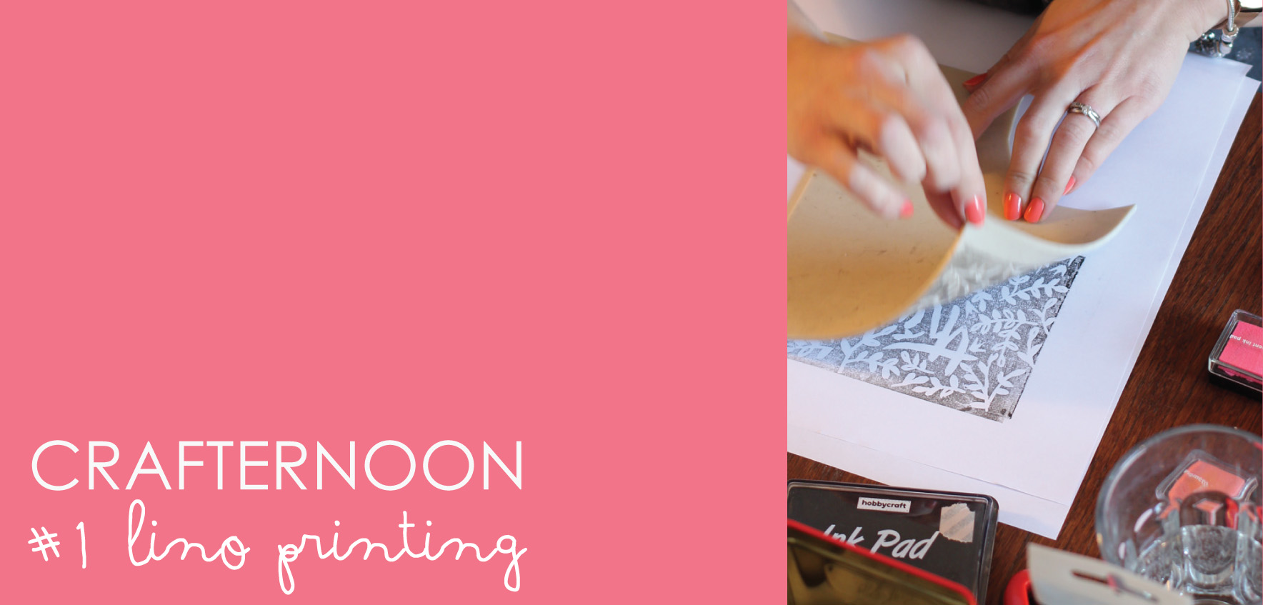 The first of our crafternoon sessions – #1 lino printing
 It was a good day, fuelled by tea, pastries and good conversation : )
 Lovely geos from the lovely Laura
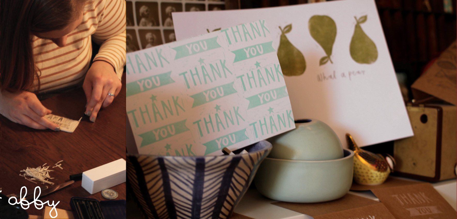 It was the right time of year for people wanting to say thank you after Christmas, so this was number one on a few of the crafternooners list of things they’d like to achieve. Thank you #1 from Abby
 Thank you #2, reverse foliage and full bleed from Charlotte
 Mark-making and a big thank you from Alex. Thank you #3
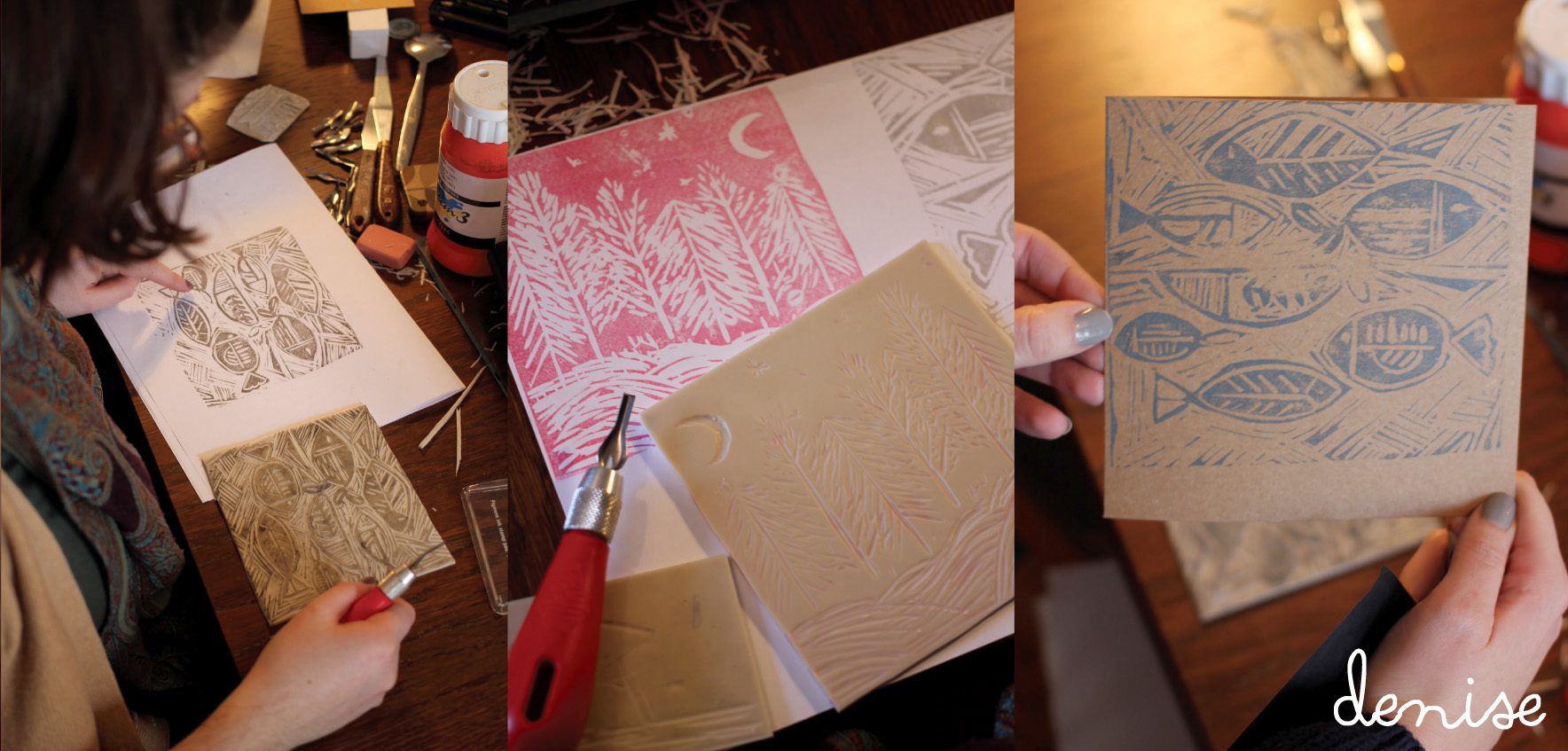 Denise was on fire with fishes and a winter scene.
 Beautiful butterflies from Jo
 Foliage, flowers and a little geo from Karen
Lillapa Christmas card 2015
So I was seduced by a bit of subtle sparkle this Christmas – subtle sparkle, is that possible? : )
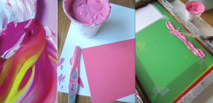 One design, two colourways. A vivid pink and kelly green, both colours mixed by eye to achieve the colour of the envelopes sourced.
 The clear foil is really beautiful to use – it gives what could be a very subtle debossing, a little help.
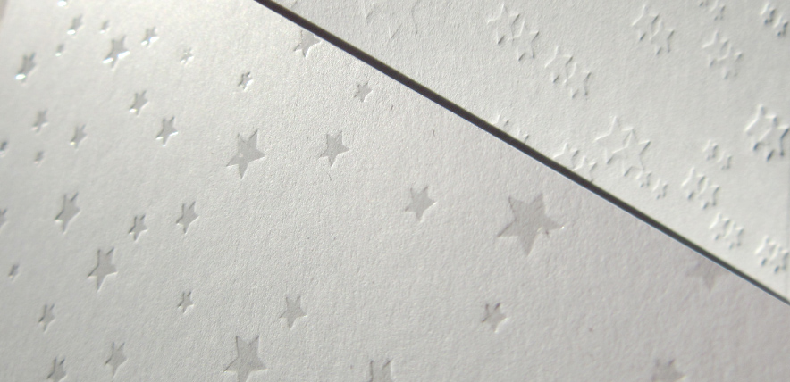 Just because I get asked, I wanted to show you the difference between clear foil (which replicates a spot UV) and a debossed image for a nice deep impression.
 Green version – just for Alex : )
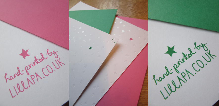 The finished prints – I love the simplicity of the design this year, with just that little pop of colour.
 All set ready for Alan the postie.
Merry Christmas everyone, hope Santa was good to you all : )
Rowen & Wren’s bespoke Christmas cards
As always it was lovely to be approached by the wonderful team at Rowen & Wren to design and print their Christmas cards this year which would be sent to their suppliers, friends and the press. A little keep-sake for your tree.
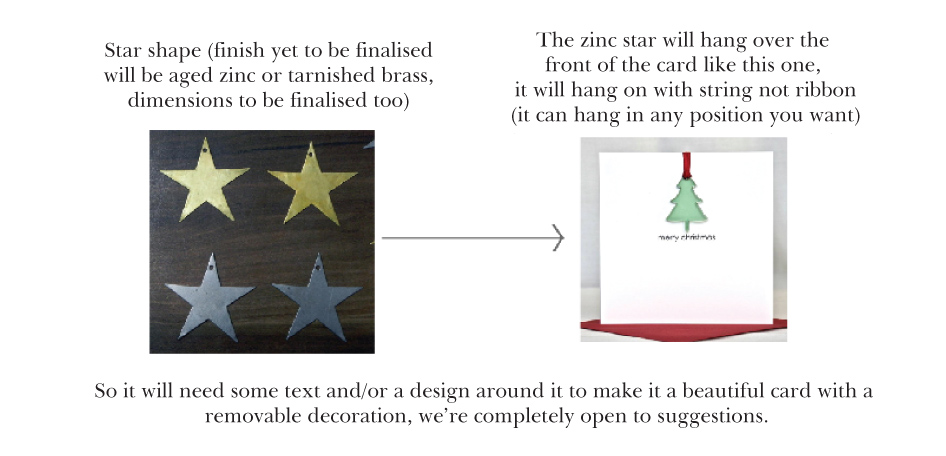 I think this is what I love about working with Rowen & Wren – nice open briefs and a trust in the end result. Only criteria was, that it was to feature a tip-on brass star decoration that could be removed and kept.
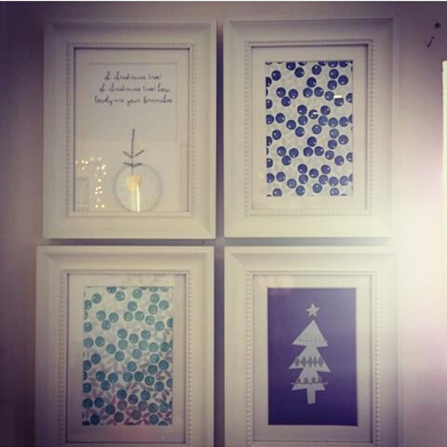
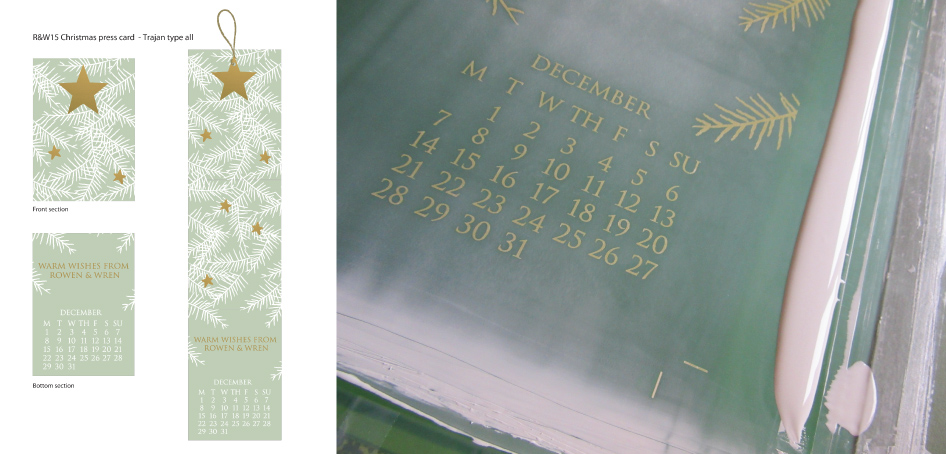 The final proposal was an amalgamation of two proposals, the close up tree detail with the decoration, and the calendar entry. I really liked the idea of the card having a function as a count down to christmas so you could use both the star as a decoration but the card itself had a purpose.
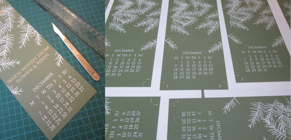 First print pass, and a little trimming – testing the fold.
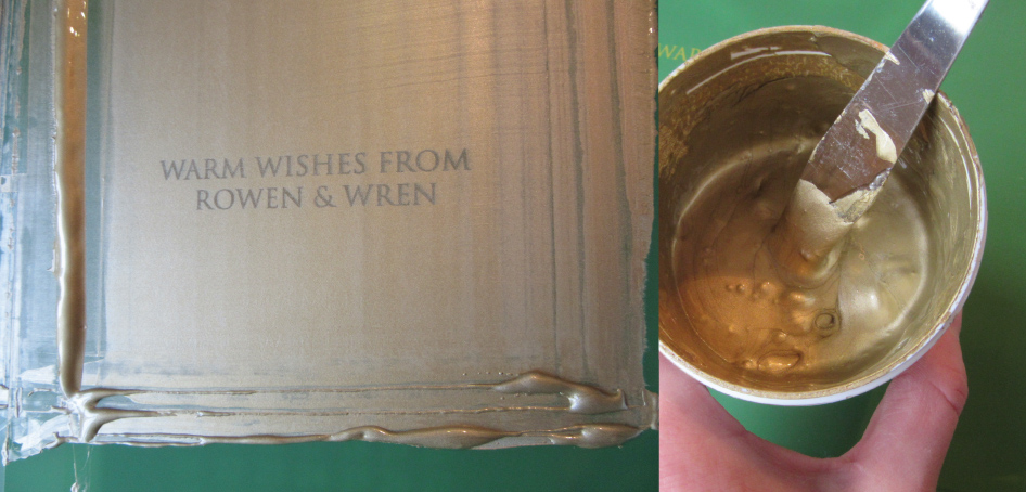 Goollllllllllldddddddddd! Sooooo shiny – I love it.
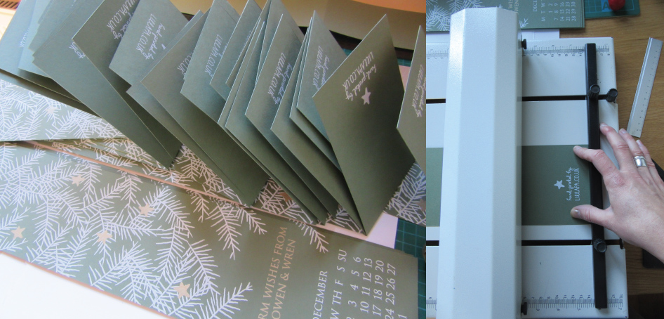 Final consertina folding and stacking ready for delivery.
 All done and dusted, it’s the total satisfaction of each print pass revealing more of the design, building up the layers.
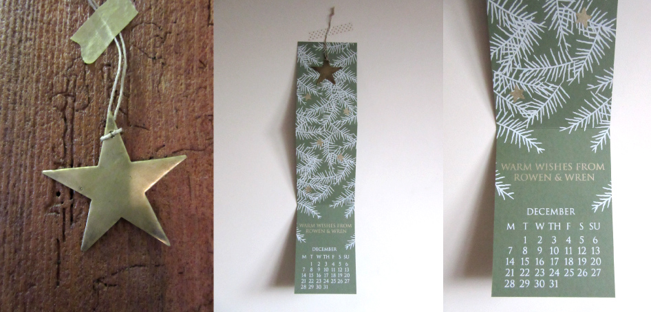 The decoration, the hanging calendar, and the calendar entry, how many more sleeps?
Lillapa regram
A little Lillapa regram from @karenlass on Instagram
http://instagram.com/p/xz4TsPgLYe/?modal=true
Smart as a…
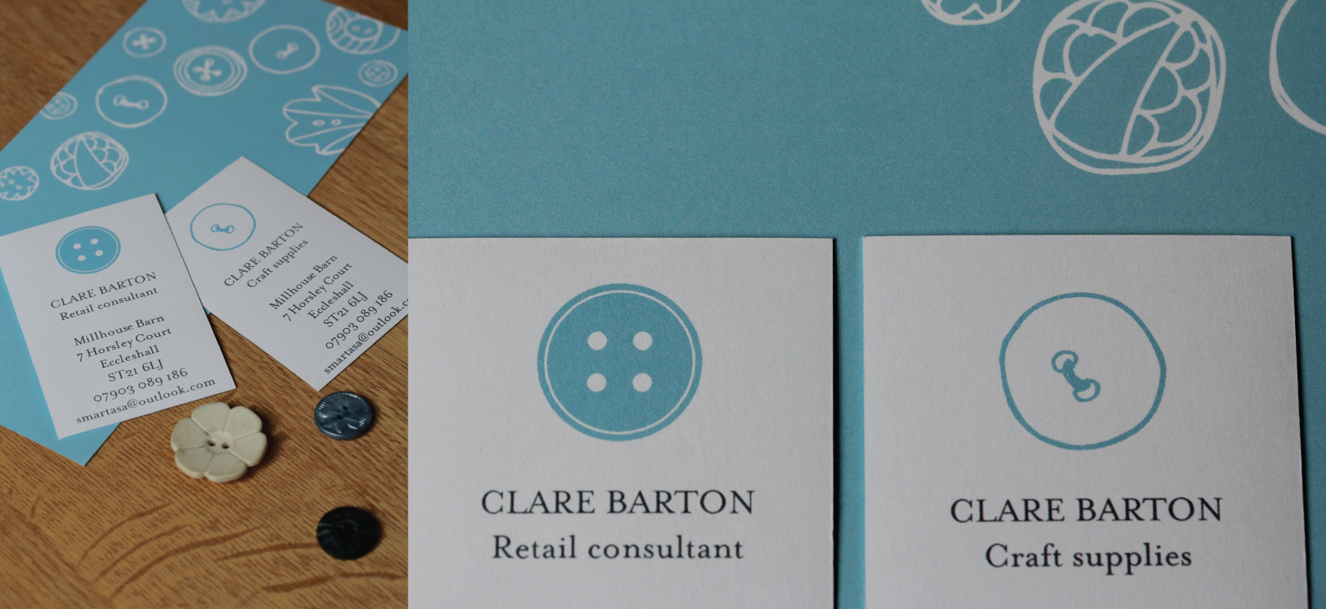
Interesting project designing an identity with a dual personality. On the one hand a creative craft business – fluid, fun and full of energy, and on the other hand a professional retail consultancy, still with a creative output but geared to a different customer base entirely – professional, business to business advice. I liked the idea of using the same motif but treating it in different ways to show the two scopes of the business proposition, appealing to the crafter and to businesses.
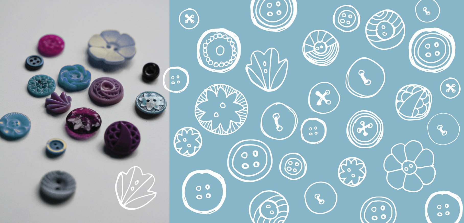 Starting point – raiding my button jar and initial sketches
 The full suite. Dual letterheads, comp slips and business card. Sticker seals were the icing on top.
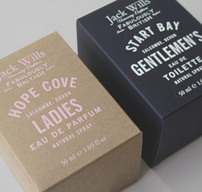
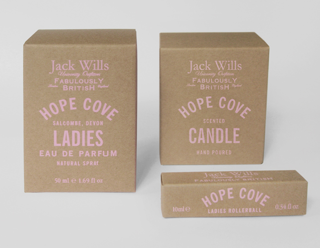
Lovely packaging – Sarah Thorne for Topshop and Jack Wills
I couldn’t resist, I saw the beautifully simple illustrations, hand drawn and quirky, the products looked so wonderful together, a lovely coherent collection – really striking. I was hooked, I couldn’t help it and I may have bought a couple of items.
I loved the hand drawn text and illustrations, uncoated paper stock, small droplets used for the waterproof mascara and starry sprinkles for the highlighter. Beautiful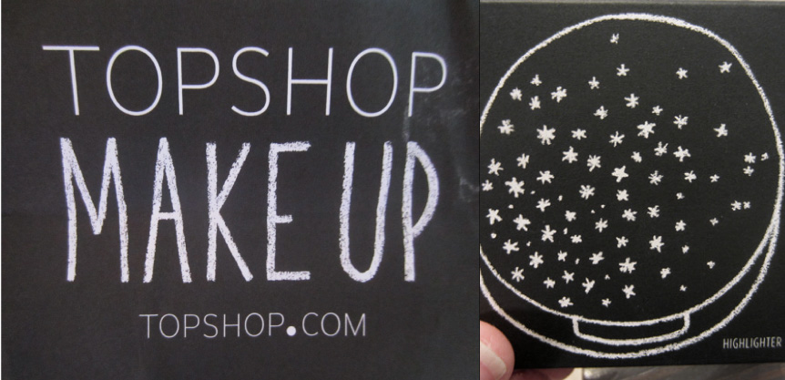 What a clever lady Miss Thorne is, you can see more of her work here.
http://www.sarahthorne.co.uk/topshop%20make%20up.html
I didn’t realise Sarah had designed the packaging for Jack Wills fragrance too, saw it just the other week, I liked the soft pink on Kraft paper