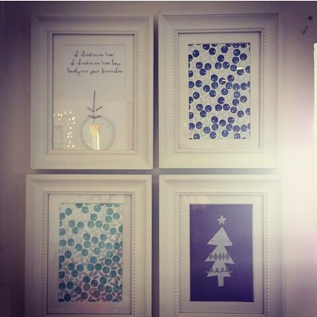
So I was seduced by a bit of subtle sparkle this Christmas – subtle sparkle, is that possible? : )
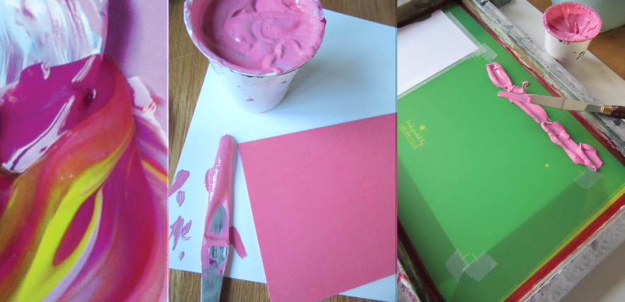 One design, two colourways. A vivid pink and kelly green, both colours mixed by eye to achieve the colour of the envelopes sourced.
 The clear foil is really beautiful to use – it gives what could be a very subtle debossing, a little help.
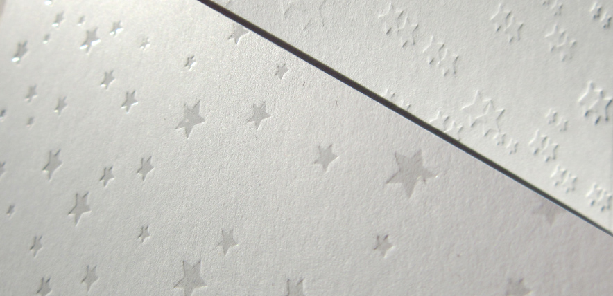 Just because I get asked, I wanted to show you the difference between clear foil (which replicates a spot UV) and a debossed image for a nice deep impression.
 Green version – just for Alex : )
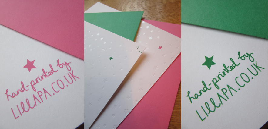 The finished prints – I love the simplicity of the design this year, with just that little pop of colour.
 All set ready for Alan the postie.
Merry Christmas everyone, hope Santa was good to you all : )
Tag Archives: christmas cards
Rowen & Wren’s bespoke Christmas cards
As always it was lovely to be approached by the wonderful team at Rowen & Wren to design and print their Christmas cards this year which would be sent to their suppliers, friends and the press. A little keep-sake for your tree.
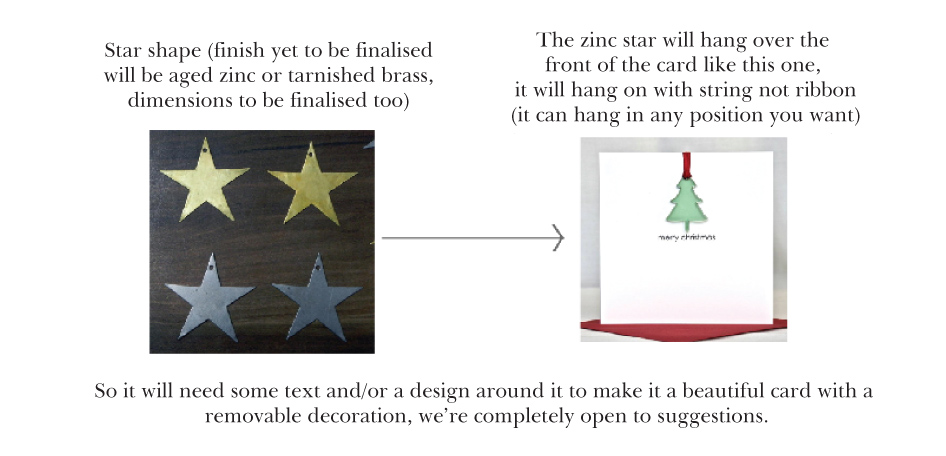 I think this is what I love about working with Rowen & Wren – nice open briefs and a trust in the end result. Only criteria was, that it was to feature a tip-on brass star decoration that could be removed and kept.
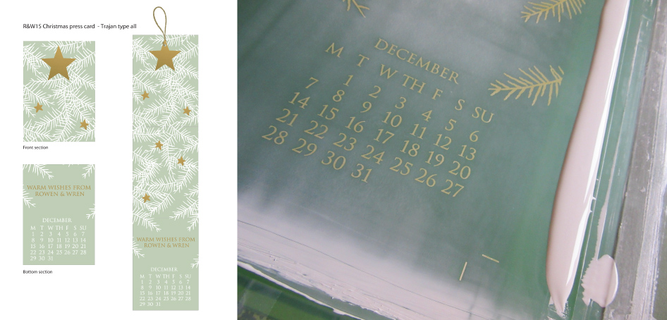 The final proposal was an amalgamation of two proposals, the close up tree detail with the decoration, and the calendar entry. I really liked the idea of the card having a function as a count down to christmas so you could use both the star as a decoration but the card itself had a purpose.
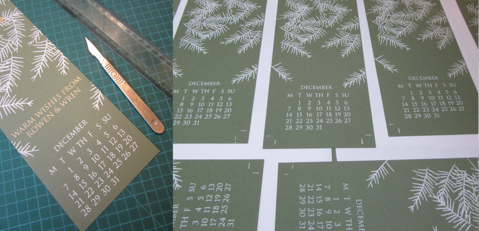 First print pass, and a little trimming – testing the fold.
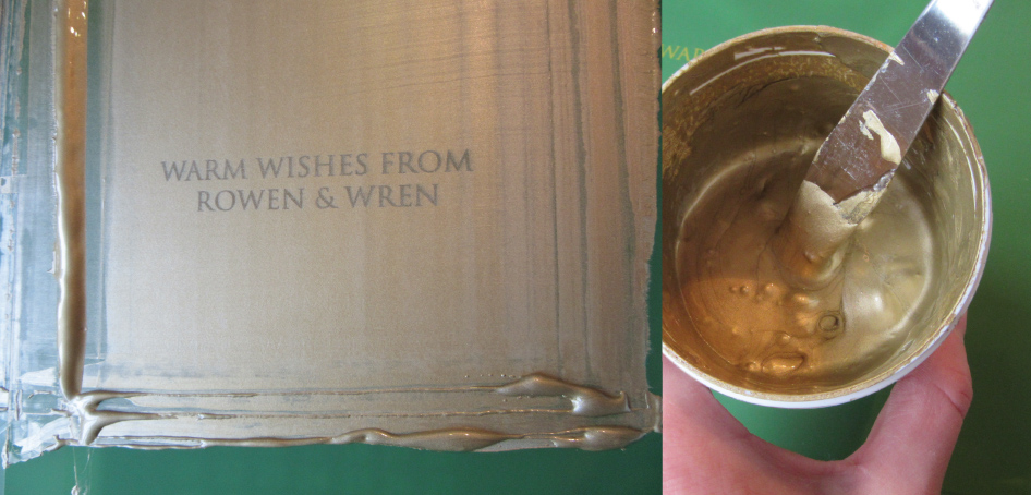 Goollllllllllldddddddddd! Sooooo shiny – I love it.
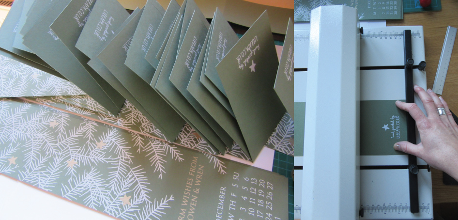 Final consertina folding and stacking ready for delivery.
 All done and dusted, it’s the total satisfaction of each print pass revealing more of the design, building up the layers.
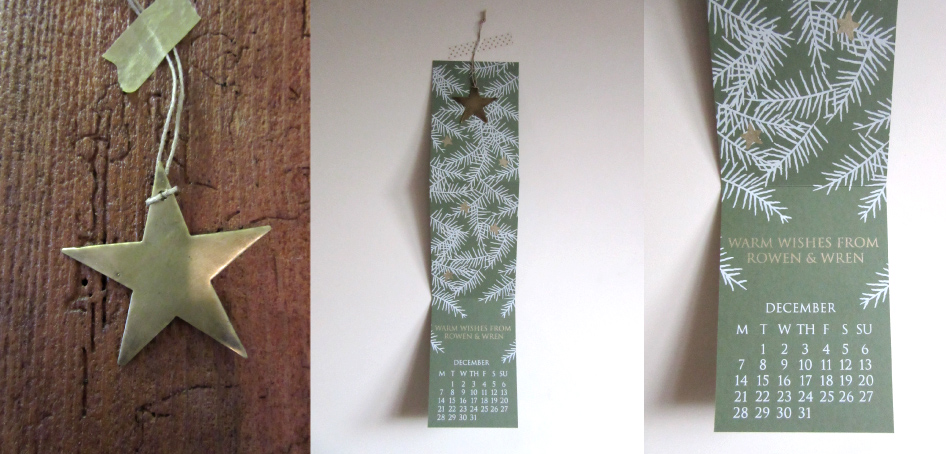 The decoration, the hanging calendar, and the calendar entry, how many more sleeps?
Lillapa regram
A little Lillapa regram from @karenlass on Instagram
http://instagram.com/p/xz4TsPgLYe/?modal=true
Lillapa Christmas card 2013
Tinsel, trees and novelty jumpers
Country homes & interiors magazine
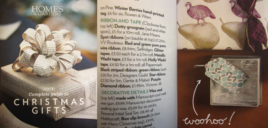
We’re in Homes and Gardens magazine
A few kind words…
Rowen & Wren Christmas cards – Winter berry design
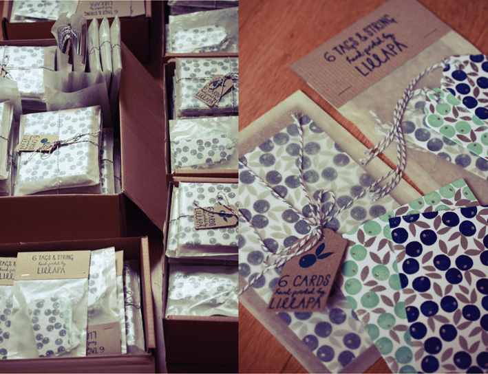
Imagine my excitement when I was approached by the lovely Lucy at Rowen & Wren, to design and print a set of Christmas cards and gift tags for their new AW13 collection.
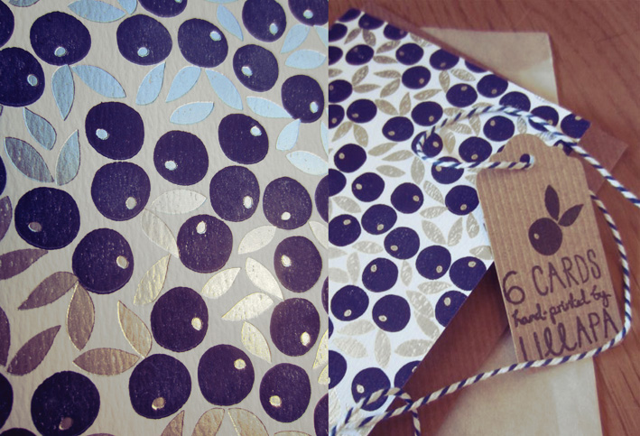
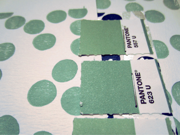
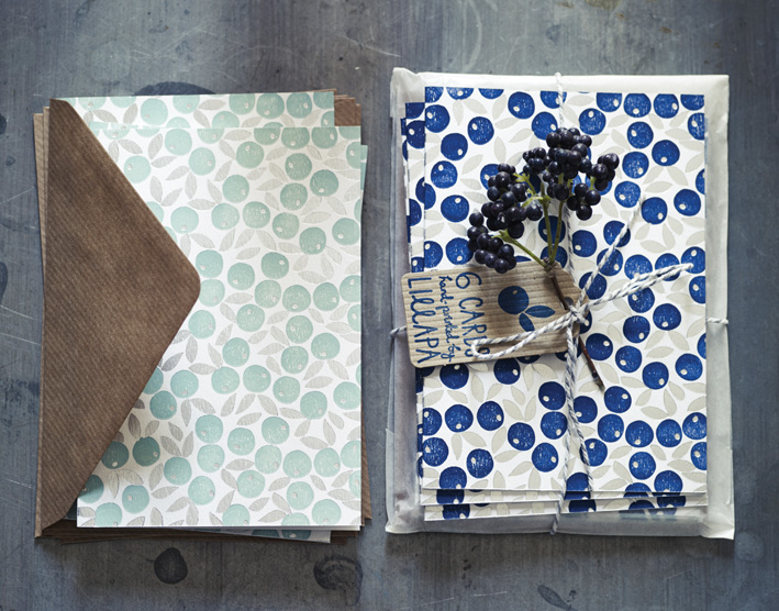
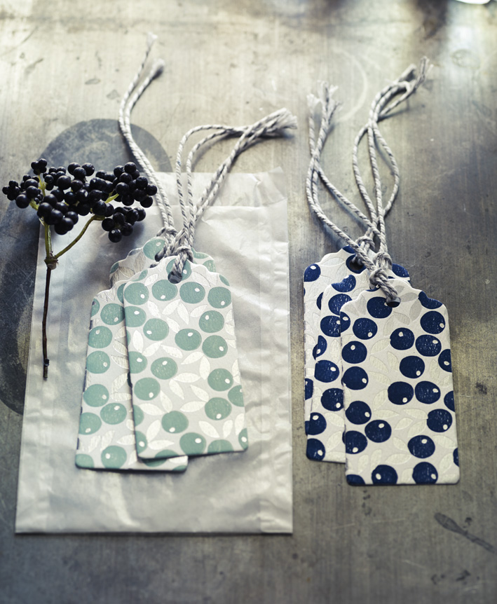
Lucy loved the cosy christmas design from last year with our winter trees and log cabins, so I wanted to present a few options I thought might hit the mark. I liked the idea of producing something a little more classic, that suited Rowen and Wren and the direction they were taking. They also had a lovely colour palette to play with, incorporating inky blues, sage greens, soft greys and burnt oranges. In the end we settled for the winter berry design, in two colourways - indigo and eucalyptus, letterpress printed onto a beautiful textured stock, and finished with a flourish of satin silver foil. Righty-ho, time to rustle up the troops and get started.
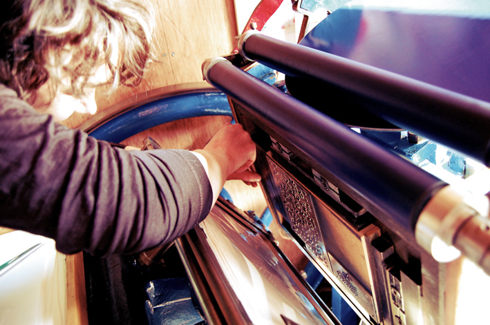
Making minor adjustments to Bertha, before the initial print run.
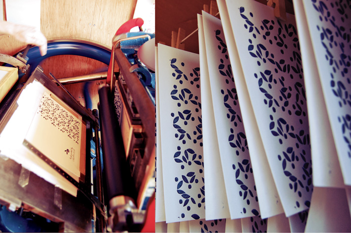
First pass, and safe storage while we’re waiting for the ink to set off, ready for the shiny bit
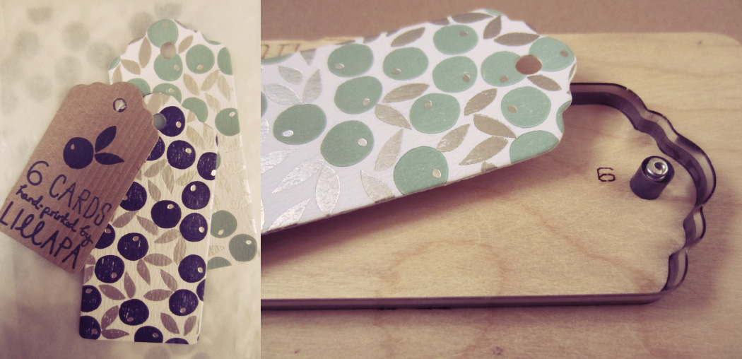
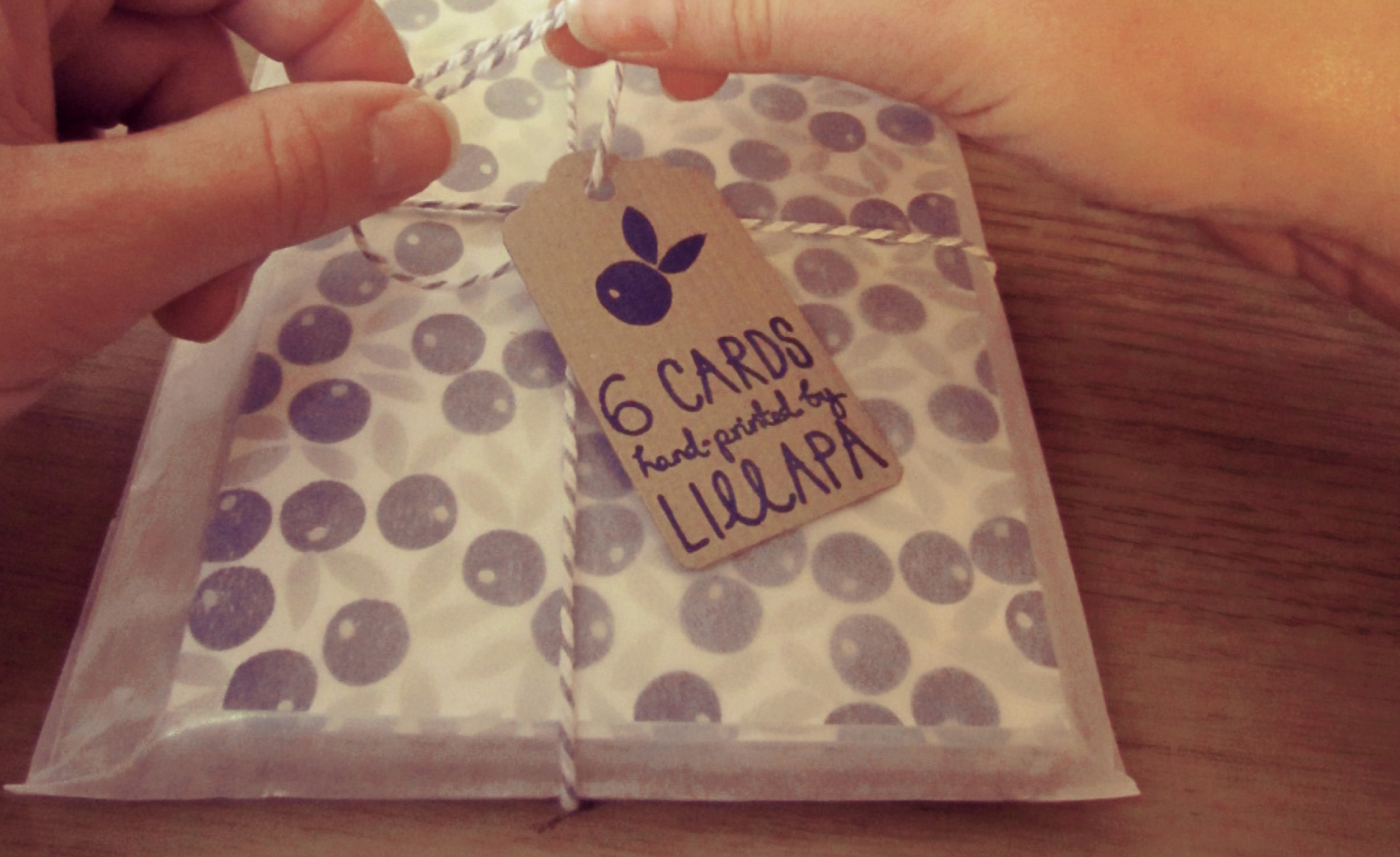
I liked the contrast of the ink on the textured 320gsm card and the super slick foil finish. The card sets are completed with ribbed Kraft envelopes in a glassine bag. The berry motif was also picked up in the kraft tags and header cards too. I used rubber stamps for the packaging and bound the envelopes with bakers twine picking up the colour from the prints. A pleasing result.
Matching the second colourway, almost there.
The tags were hand pressed from a cutting die I designed, I preferred the scalloped edge to the usual tag shape, I thought it suited the design better.
Just adding the finishing touches.
The final cards and tags in their glassine bags and kraft packaging.
Packed and ready for off, how satisfying
The final pictures shot by Rowen and Wren…Thank you kindly R&W xx
If you’d like to purchase a set of cards or tags you can find them here.
http://www.rowenandwren.co.uk/servlet/the-301/Winter-Berries-Hand-Printed/Detail

