Anna & Ian’s wedding invites

A beautiful spring wedding and a vibrant palette
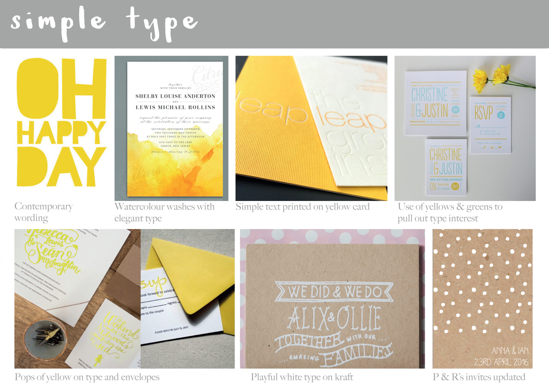
After chatting to Anna and getting further details and an idea of what the couple were looking for, I compiled initial mood boards to show potential direction – this one is for the simplicitity of type…
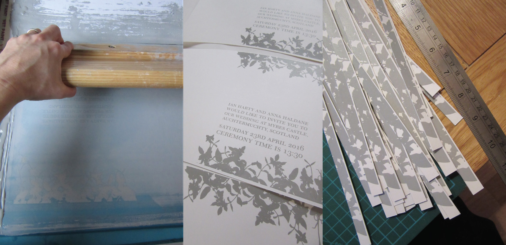
…and this one to be suggestive of spring – but not to fussy. They loved the idea of yellow as daffodills were going to be part of their floral displays on the day.First pass, the grey type for the front cover – simple and elegant, with leaves being used over flowers as decoration.
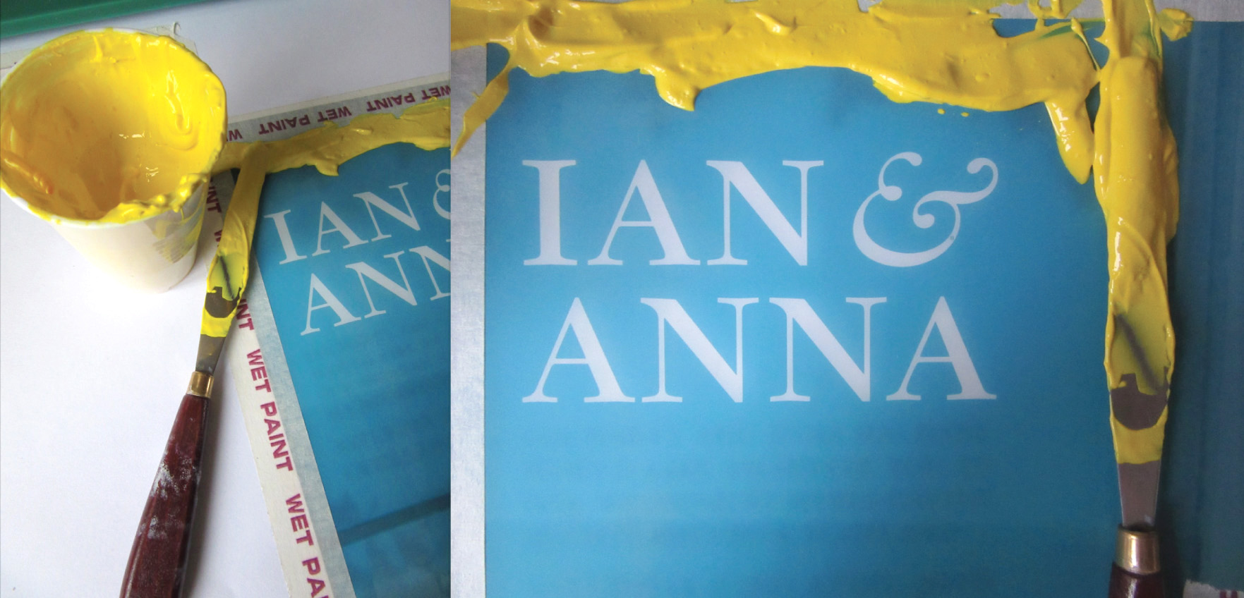
Love the yellow – mixed to match the vibrant yellow envelopes.
Second pass and initial cuts to enable registration of the internal type details
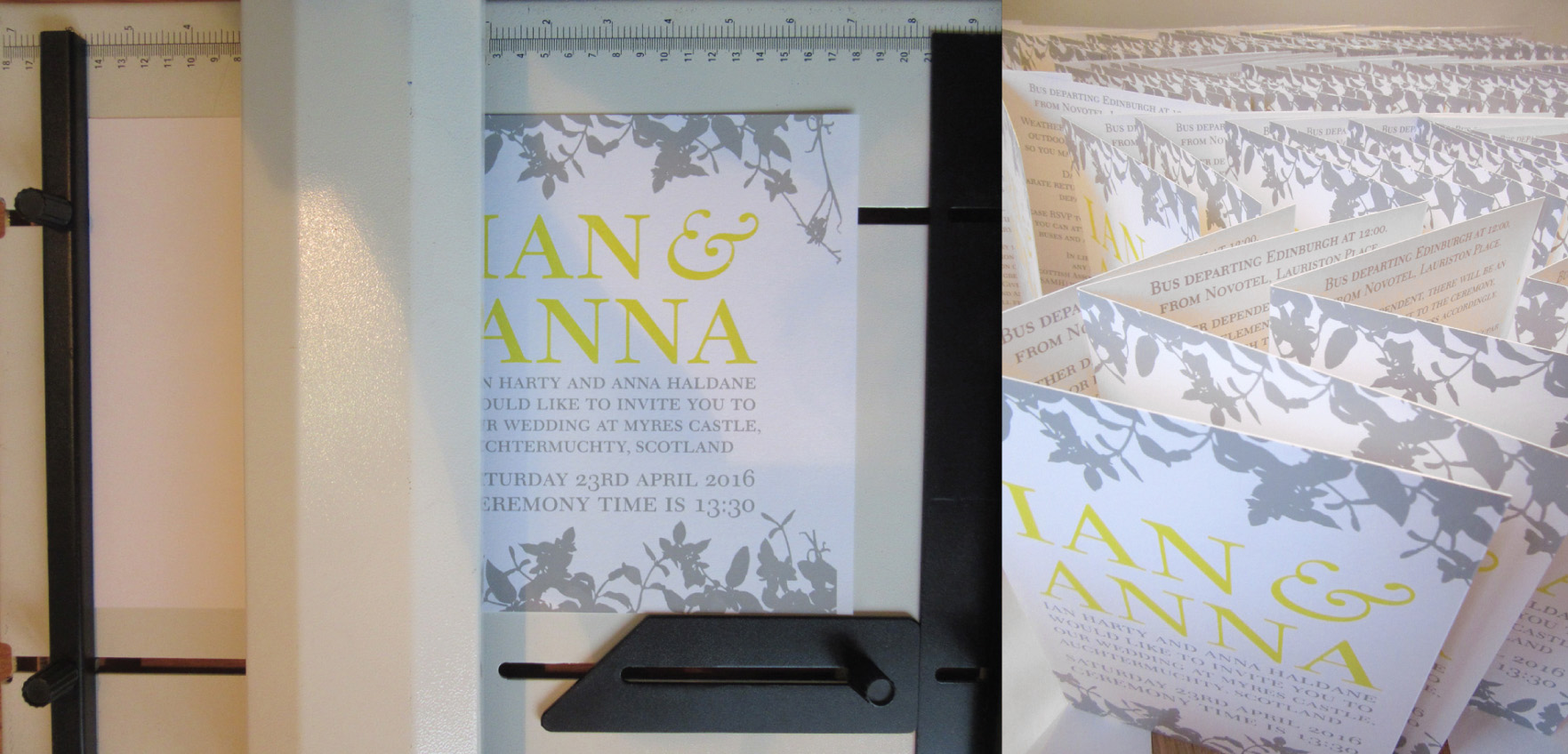
All printed, time for final trimming and the fold
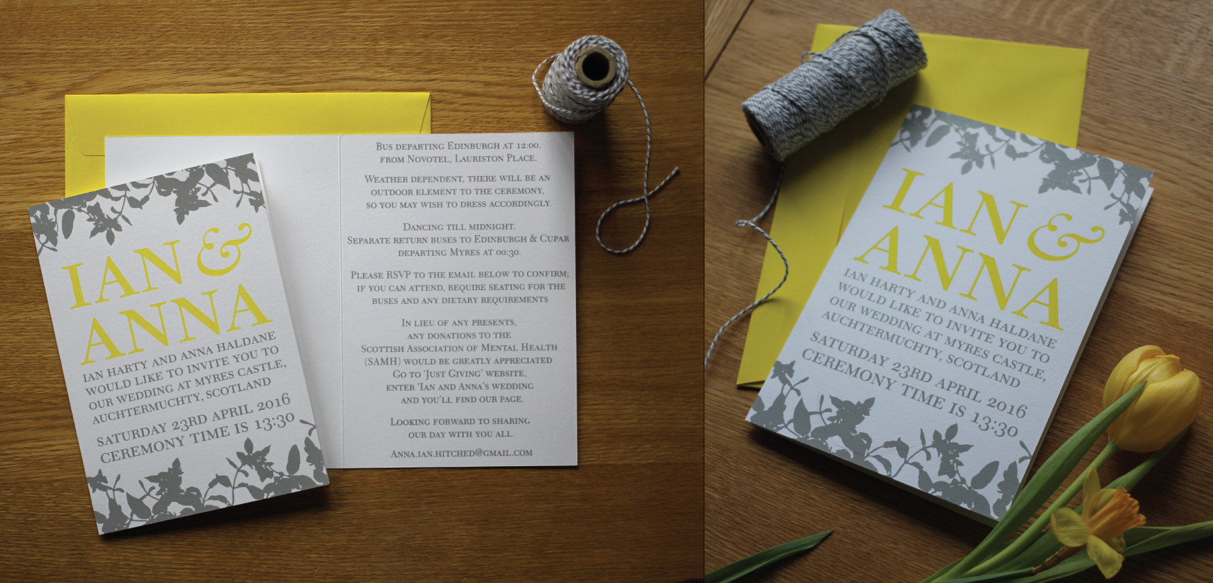
The finished invite, the yellow is a very happy colour indeed : )


Lillapa Christmas card 2015

So I was seduced by a bit of subtle sparkle this Christmas – subtle sparkle, is that possible? : )
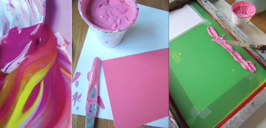
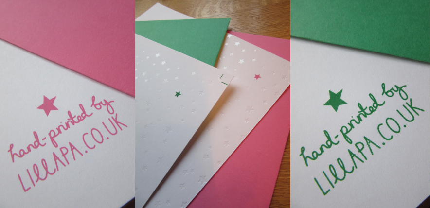
One design, two colourways. A vivid pink and kelly green, both colours mixed by eye to achieve the colour of the envelopes sourced.
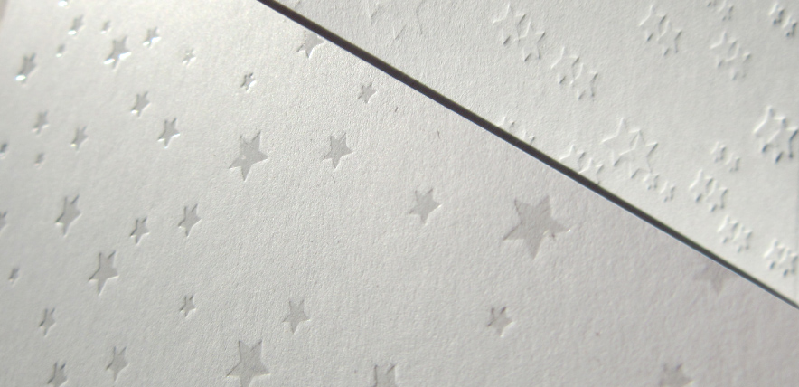
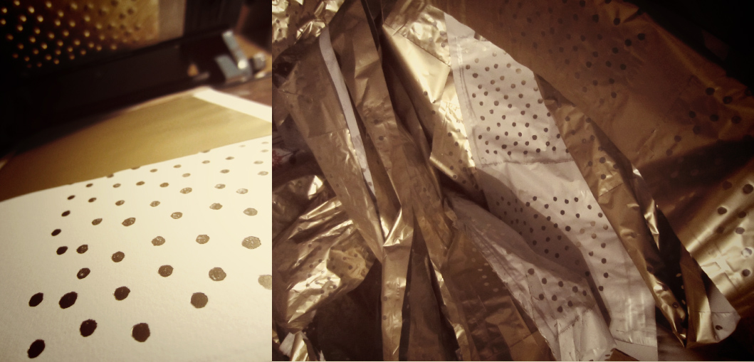
The clear foil is really beautiful to use – it gives what could be a very subtle debossing, a little help.
Just because I get asked, I wanted to show you the difference between clear foil (which replicates a spot UV) and a debossed image for a nice deep impression.
Green version – just for Alex : )
The finished prints – I love the simplicity of the design this year, with just that little pop of colour.
All set ready for Alan the postie.
Merry Christmas everyone, hope Santa was good to you all : )
Rowen & Wren’s bespoke Christmas cards

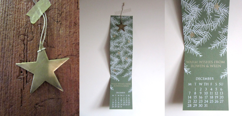
As always it was lovely to be approached by the wonderful team at Rowen & Wren to design and print their Christmas cards this year which would be sent to their suppliers, friends and the press. A little keep-sake for your tree.
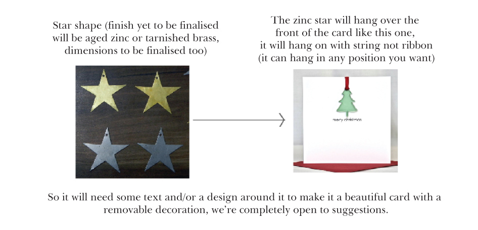
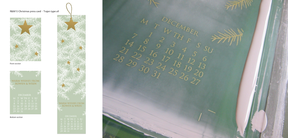
I think this is what I love about working with Rowen & Wren – nice open briefs and a trust in the end result. Only criteria was, that it was to feature a tip-on brass star decoration that could be removed and kept.
The final proposal was an amalgamation of two proposals, the close up tree detail with the decoration, and the calendar entry. I really liked the idea of the card having a function as a count down to christmas so you could use both the star as a decoration but the card itself had a purpose.
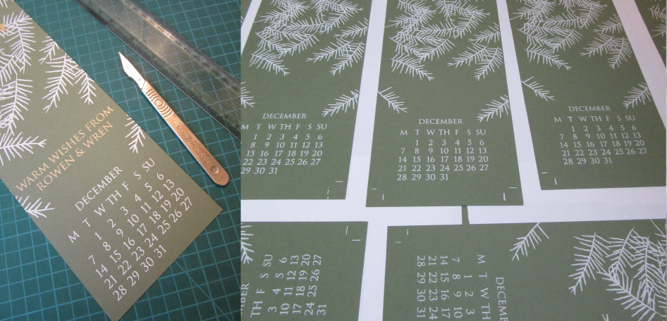
First print pass, and a little trimming – testing the fold.
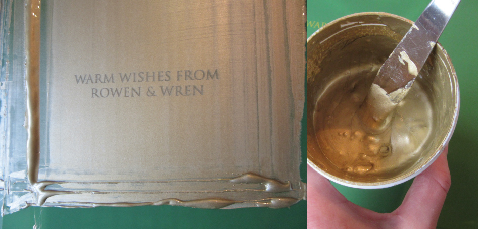
Goollllllllllldddddddddd! Sooooo shiny – I love it.
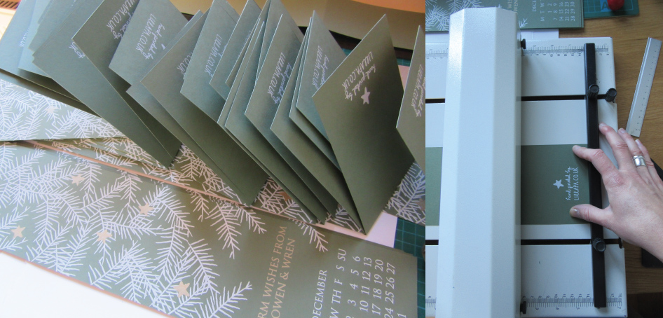
Final consertina folding and stacking ready for delivery.
All done and dusted, it’s the total satisfaction of each print pass revealing more of the design, building up the layers.
The decoration, the hanging calendar, and the calendar entry, how many more sleeps?

Kerry & Chris’s wedding suite

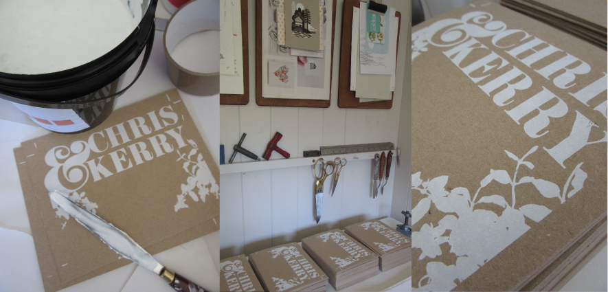
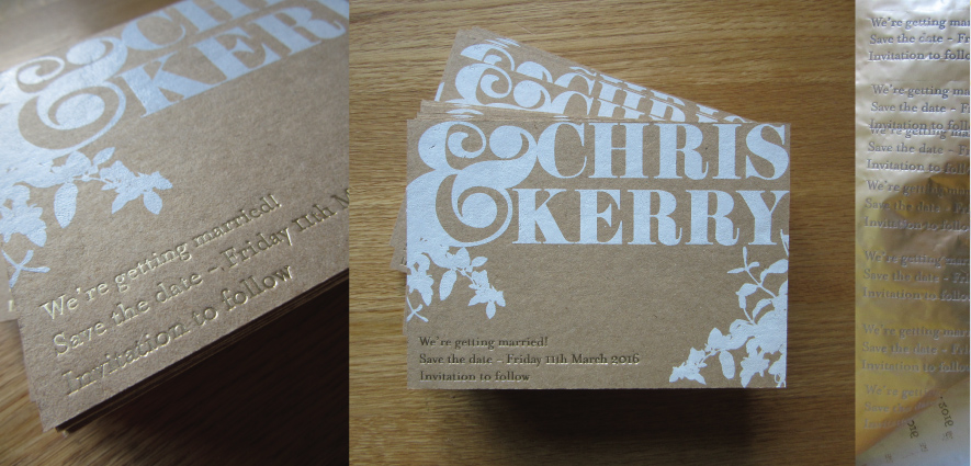
A lovely woodland inspired wedding suite for Kerry and Chris soon to be married in March. They liked the idea of using the very humble kraft card but adding luxury with the addition of gold foil and the pop of an intense white ink. This was a lovely project as it required initial direction and moodboards, which is always a satisfying part of the process – helping to make sense of all the elements and ideas the couple have.
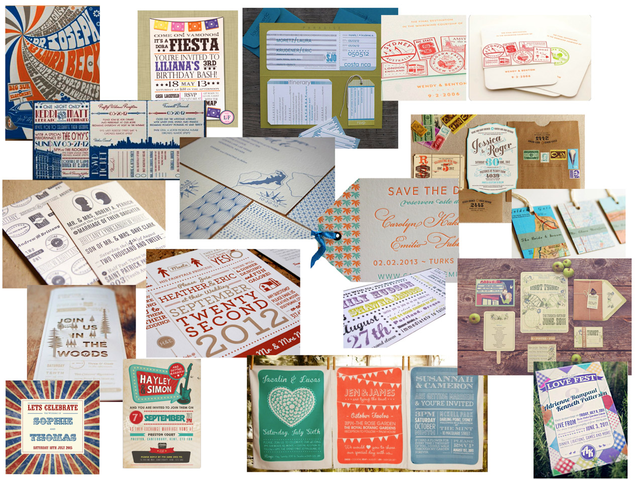
First things first – a little bit of direction. This was a lovely open brief, so it was good to listen to what the couple were after, what they liked and so on and propose a couple of different directions/themes which might appeal.. The image above is an edited view of proposed colours, flowers, cake details, materials, wedding setting and details to inspire the couple and set the scene.
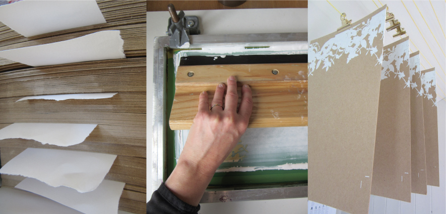
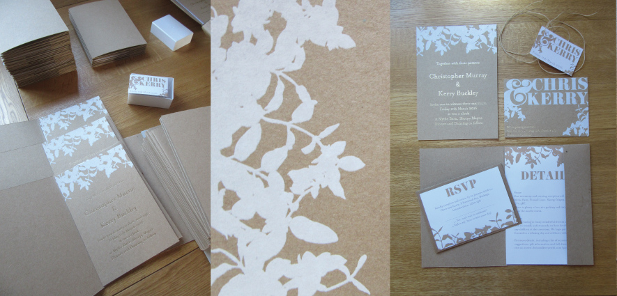
 Kraft card stacked ready to go, and the first run of invtes. Screen-printed with opaque white for a super punchy colour.
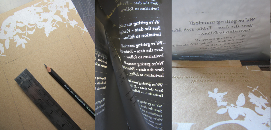
Save the dates, an adaption of the main design but still with the white foliage and gold foil mix.
Foiling stage – I love this bit, always satisfying, aways effective, and it works beautifully on the substantial Kraft card.
The finished Save the date cards.
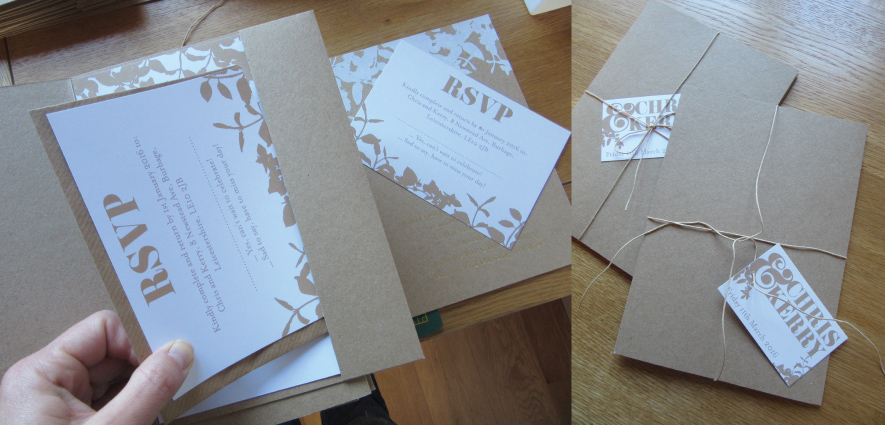
The kraft folders were all made by hand to allow the kraft colour to be consistant throughout the suite. They were teamed with digitally printed elements for the RSVP and the details inserts. Again the neutral print matching back to the kraft colour.
Just packing up – assembling the final packs ready for delivery. A little paper string fastening and printed tag complete the package.

Ben & Jen’s wedding invites

I’m not sure if you remember Ben & Jen and the adventure they embarked on last year? A year spent travelling around Africa, well it just so happens that Ben proposed while they were away. Hooray! She said yes, of course!
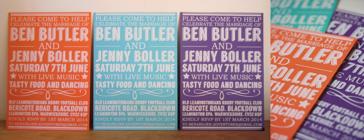
And so the time is here to embark on their wedding stationery, just like Polly and Russell, they only wanted invites printing, but are hoping to have posters and a commemorative tea-towel printed for the event : ) Love the idea! That’ll keep us busy and out of trouble.Where it all began: mood board from Jen with images she likes, the mood she wants to capture at her wedding and colour direction. Their brief was to capture a festival feel with colour inspired by their travels, ooo and not be too serious. Collectively they love music and so I wanted to try and capture the sense of an old music hall poster for their invites.

How exciting, the arrival of the card! 700 gsm Colorplan in mandarin, turquoise and purple, super chunky – lovely. They’ll be a single sided A5 card in the end.
Lining up the screen, one colour print across the three colours of card, the beauty of this design is it could work on any medium, grey board, kraft, choice is yours, splendid…

…and lovely prints all in a row.

All three together, the colour is going to be picked up in the venue with hand-made garlands, fans and paper pom-poms. It should have a real festival feel. We’ll be printing some large A2 posters too nearer the time, they’ll be pinned up around the space ready for a grand old knees up.

A simple white colorplan C5 envelope, and they’re ready for off. Posters and tea-towels to follow : )

Polly & Russell’s wedding invites

Today I dropped off P&R’s wedding invites, felt like I was walking round London with a million of your finest pounds. Precious cargo : ) I was relieved to hand them over to Polly who loved the end result, hooray! It was great to catch up and hear the latest wedding plans, it’s going to be a great do : )

Setting up, plate – check, chase locked and ready to roll, check, funny drawing layout thing, check…

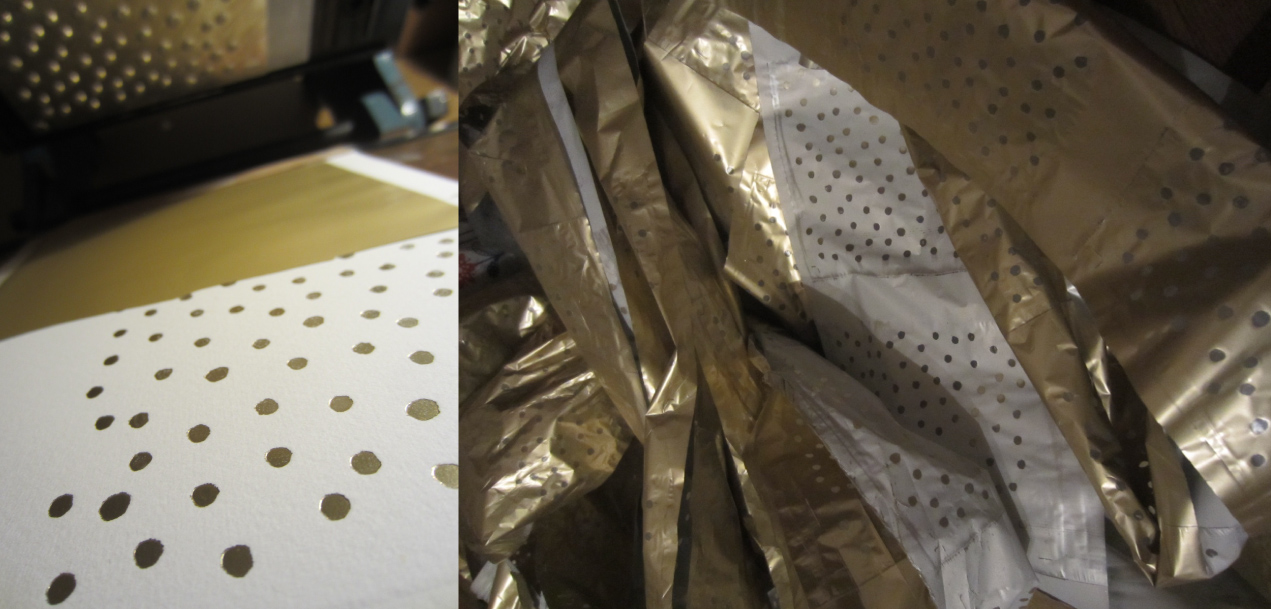
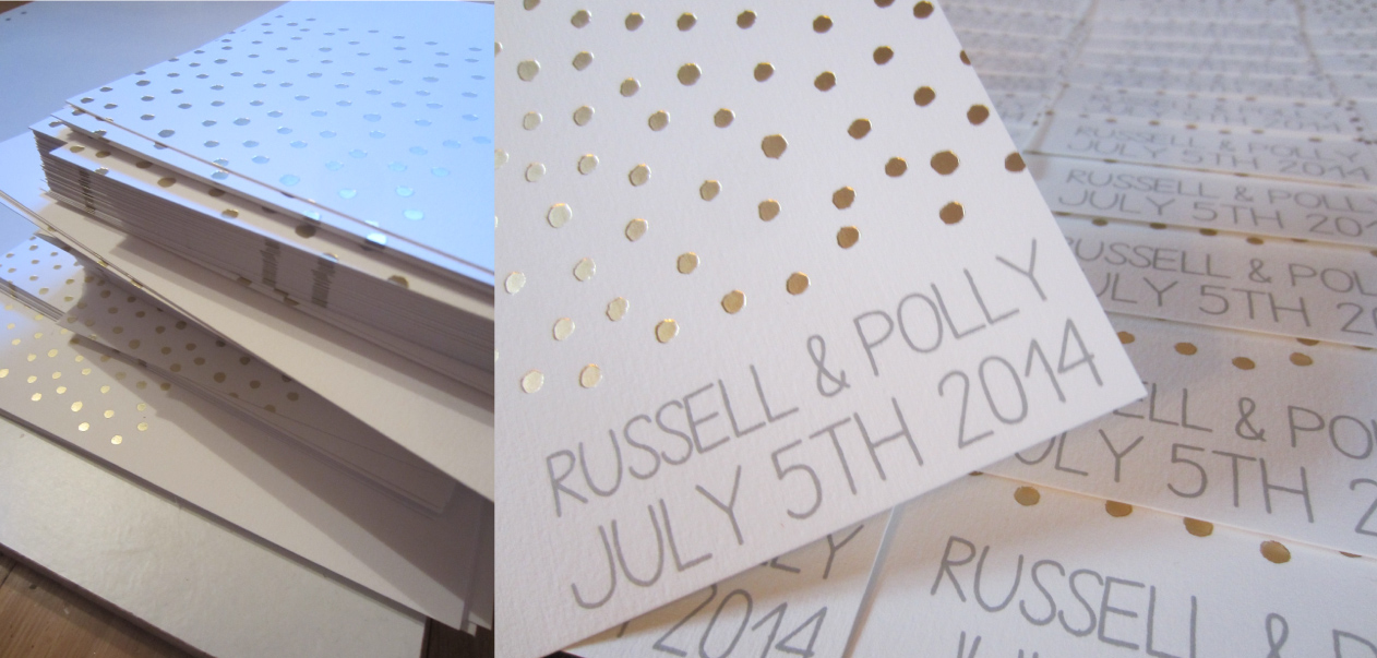
Charlie yet again coming into his own – loving the foiling process, so satisfying and so immediate.

Stacked and ready to go for the next round. Polly decided on screen printing the text over letterpress so we could achieve a nice contrast between the debossed foil layer and the flat colour achieved with screen printing.

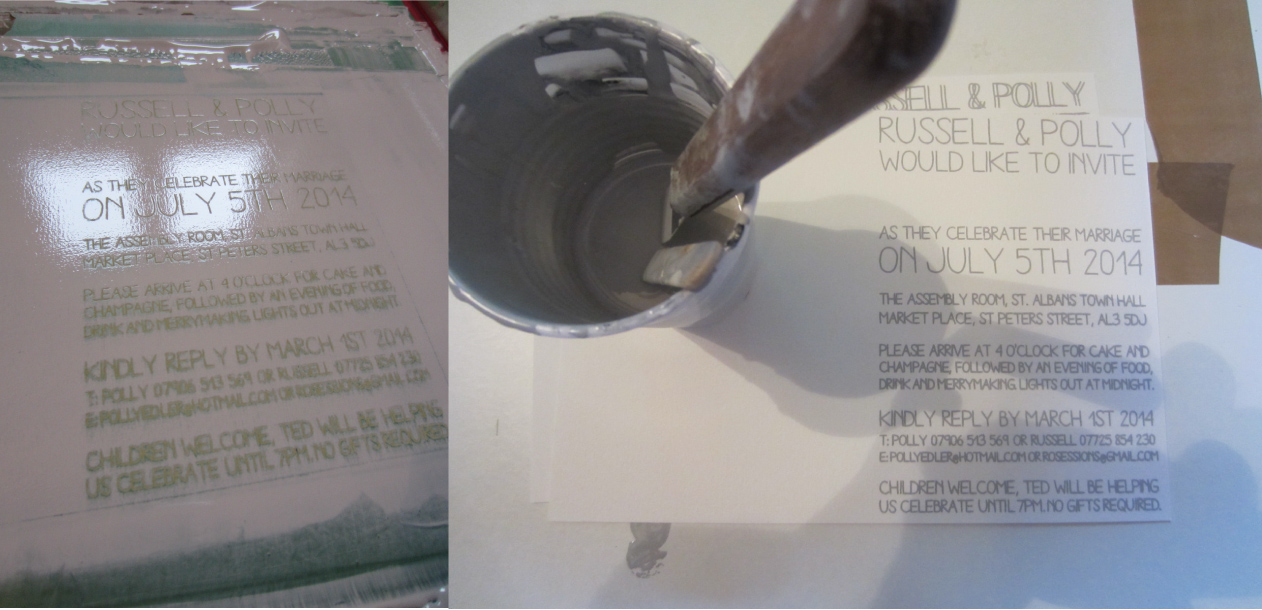
Ink mixed, alignment set. Went for a cool grey in the end to contrast against the warmer tones of the soft matt gold foil.

Loving the mix of screen and foil, both have very immediate results which you can’t fail to get excited about.

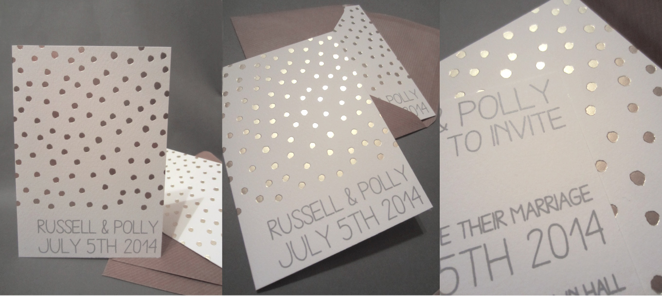
See what I mean? Grey and gold, yum, yum, yum.

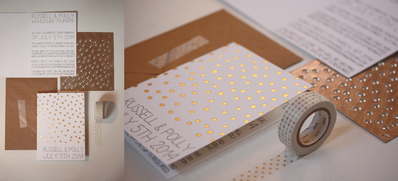
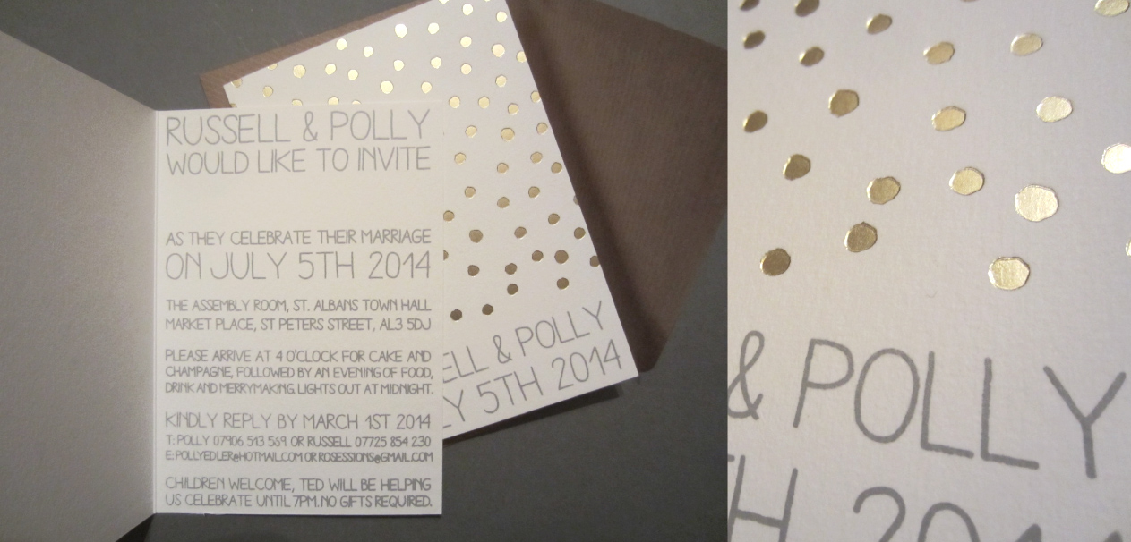
Small A6 folded card using a 50/50 cotton and wood pulp mix provides a lovely texture but nothing too severe or coarse. Printed both sides and finished with a kraft envelope and gold spotty washi tape.

The finished invites. Very pleasing